|
|
| Line 1,100: |
Line 1,100: |
| | |resolution=512×512 | | |resolution=512×512 |
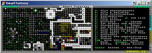
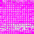
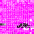
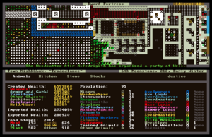
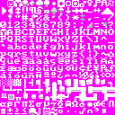
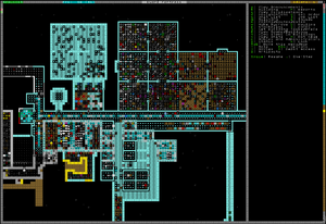
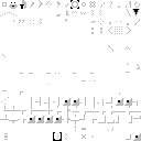
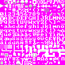
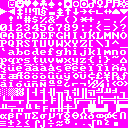
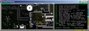
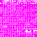
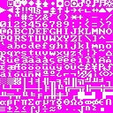
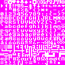
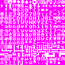
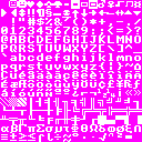
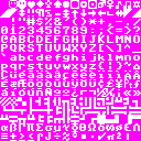
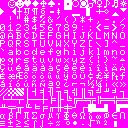
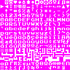
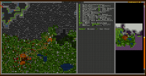
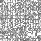
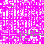
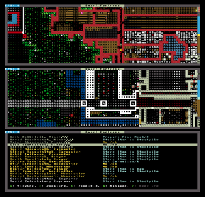
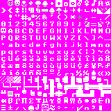
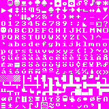
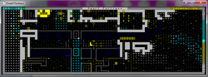
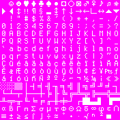
| | |comments= Runeset is an RSCII (Runic Standard Code for Information Interchange) font pack for Dwarf Fortress. Much more dwarfy than that American standards stuff. | | |comments= Runeset is an RSCII (Runic Standard Code for Information Interchange) font pack for Dwarf Fortress. Much more dwarfy than that American standards stuff. |
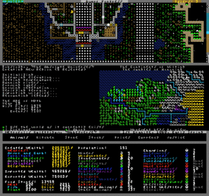
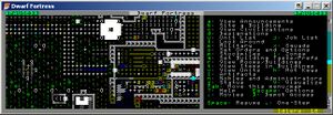
| − | [[Image:Runeset Gameplay.jpg|thumb|right|Runeset Example]] | + | [[Image:Runeset Gameplay.jpg|thumb|left|Runeset Example]] |
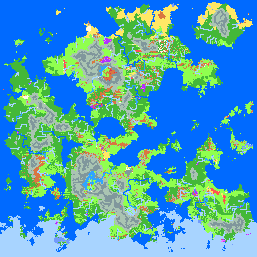
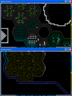
| − | [[Image:Runeset Example.jpg|thumb|right|Runeset Maps]] | + | [[Image:Runeset Example.jpg|thumb|center|Runeset Maps]] |
| − | [[Image:Runeset_Text.jpg|thumb|right|Runeset Text]] | + | [[Image:Runeset Text.jpg|thumb|right|Runeset Text]] |
| | }} | | }} |
| | | | |
Revision as of 03:28, 24 March 2018
- You may be looking for general information on tilesets or the Graphics set repository.
A character set, or simply tileset, is an image in BMP or PNG format that contains the 256 different tiles, corresponding to the IBM Code Page 437 (sometimes called Extended ASCII). They are used to display the main graphics.
Background
The default tilesets (640x300 and 800x600) render 8x12 and 10x12 characters respectively, with majuscule latin letters occupying a 7x9 box, and appear broadly similar to the IBM MDA font based on the shape of the "0", "g", and "f" characters (but with slight differences including the "0", "W", and "y"). The exact origin of the DF font is unknown.
Installation
To use a specific tileset with Dwarf Fortress you must perform the following steps:
- Download the tileset to your computer. Each tileset is just an image, so there is no separate download link. (Right-Click on the tileset image and Save-As.)
- If necessary, convert the tileset to the correct image format for the version of DF you are using:
- For DF 0.28.181.40d or older: Open the file in an image editor and save it as a 24-bit bitmap (BMP) if it isn't already in that format.
- For DF 0.31 or newer: Open the file in an image editor and save it as a PNG with transparency if it isn't already in that format.
- Move/Copy the file to the DF art directory (<DF Dir>/data/art).
- Edit the initialization configuration file (<DF Dir>/data/init/init.txt) to specify the tileset file to use. There are four locations that can be changed:
- Specify the tileset for a windowed display by setting the filename in the [FONT:<filename>] tag.
- Specify the tileset for a full-screen display by setting the filename in the [FULLFONT:<filename>] tag.
- Specify the tileset for a windowed graphical display by setting the filename in the [GRAPHICS_FONT:<filename>] tag.
- Specify the tileset for a full-screen graphical display by setting the filename in the [GRAPHICS_FULLFONT:<filename>] tag.
- Once you have made the changes you need to remember to save the file.
If the selected tileset requires modifications to the Raws, you will have to make those edits. What those changes are will depend on the tileset itself.
Once the file is saved and the required changes are made, you are ready to play DF with your new tileset!
Square Tilesets
1×1
|
| Title
|
[[#{{{filename}}}|{{{filename}}}]]
|
| Author
|
Loud Whispers
|
| Dated
|
2015-03-30
|
| Tile Size
|
1×1
|
| Resolution
|
80×25
|
| Versions
|
|
| Comments
|
So on suggestion I made the new version of Monoscii which has every tile be 1 pixel, the entire map nearly fits into the screen just fine. Monoscii Lite is superior in every way, the information is denser, crisper and cleaner. pUrists will finally be one step closer to the most pUrist DF possible. (forum post link)
|
|
|
5×5
|
| Title
|
[[#{{{filename}}}|{{{filename}}}]]
|
| Author
|
Kein
|
| Dated
|
2008-8-7
|
| Tile Size
|
5×5
|
| Resolution
|
400×125
|
| Versions
|
|
| Comments
|
A large 257x257 DFMA world gen map can be found here.Updated 08/06/08. Changed most text characters as well as some others to 4x4 with blackspace to avoid tiling. Most characters have been revised to be spaced out to be more distinguishable in such a small set. After seeing the dev update earlier today about increasing your view size I decided to create this small font. This has been built completely from scratch, mostly while at work today. I may be making a shaded version in the future. The first image to the right is from the Abeyverse succession game.
|
|
|
|
| Title
|
[[#{{{filename}}}|{{{filename}}}]]
|
| Author
|
Zaratustra
|
| Dated
|
2008-11-20
|
| Tile Size
|
5×5
|
| Resolution
|
400×125, 800×250, 800×500
|
| Versions
|
|
| Comments
|
|
|
|
6×6
|
| Title
|
[[#{{{filename}}}|{{{filename}}}]]
|
| Author
|
Geti
|
| Dated
|
2010-08-04
|
| Tile Size
|
6×6
|
| Resolution
|
480×150, 960times;300
|
| Versions
|
|
| Comments
|
A 6x6 Tileset optimised for legibility through personal use. Not shaded on most gliphs, aiming for a crisper look. Best at 2x2 pixels.
|
|
|
|
| Title
|
[[#{{{filename}}}|{{{filename}}}]]
|
| Author
|
Lord Nightmare
|
| Dated
|
2007-11-5
|
| Tile Size
|
6×6
|
| Resolution
|
480×150
|
| Versions
|
|
| Comments
|
Made in 5 hours on 11/5/07 (I was bored and dissatisfied with other fonts). Most glyphs are really 5×6, with a seperator column.
|
|
|
|
| Title
|
[[#{{{filename}}}|{{{filename}}}]]
|
| Author
|
Lord Nightmare
|
| Dated
|
2007-11-12
|
| Tile Size
|
6×6
|
| Resolution
|
480×150
|
| Versions
|
|
| Comments
|
Version 2.05. Updated 11/12/07 to de-fuzz uppercase letters, added serifs and clarified lowercase letters, made horizontal spacing consistent throughout character set, fixed one error in the double horizontal-left-right, single-vertical-up-down character, made exclamation points consistent, thinned out question mark and inverse question mark, sharpened sideways stemless arrows, clarified international characters, and clarified some greek letters. Since v2.0: fixed 'i' 'g', fixed Yen symbol, fixed smiley 0x01 to not have an extra line to its right, lowered the period and colon characters, fixed position of 'x'. Thanks to Markavian for ideas on how to improve the font, as well as an occasional character glyph.
|
|
|
|
| Title
|
[[#{{{filename}}}|{{{filename}}}]]
|
| Author
|
Markavian
|
| Dated
|
2007-10-30
|
| Tile Size
|
6×6
|
| Resolution
|
480×150
|
| Versions
|
|
| Comments
|
The first version the tiny tileset, superceded by the version below.
|
|
|
|
| Title
|
[[#{{{filename}}}|{{{filename}}}]]
|
| Author
|
Markavian
|
| Dated
|
2007-10-30
|
| Tile Size
|
6×6
|
| Resolution
|
480×150
|
| Versions
|
|
| Comments
|
My second version of the tiny tileset, for uber small resolution DF, with improved visibility of several symbols.
Available in mkv curses 12×12 and 6×6 v2.zip.
|
|
|
|
| Title
|
[[#{{{filename}}}|{{{filename}}}]]
|
| Author
|
Nobbins
|
| Dated
|
2010-01-10
|
| Tile Size
|
6×6
|
| Resolution
|
480×150, 960×300
|
| Versions
|
|
| Comments
|
Tiny tileset for small screens, with experimental colour blending and pseudo-curved walls.
|
|
|
|
| Title
|
[[#{{{filename}}}|{{{filename}}}]]
|
| Author
|
Nobbins
|
| Dated
|
2010-06-28
|
| Tile Size
|
6×6
|
| Resolution
|
480×150, 960×300
|
| Versions
|
|
| Comments
|
Tiny tileset for small screens/large projects, using slightly Monaco-styled serifs. Transparency-supporting version needed. Forum thread.
|
|
|
7×7
|
| Title
|
[[#{{{filename}}}|{{{filename}}}]]
|
| Author
|
herrbdog
|
| Dated
|
2007-10-30
|
| Tile Size
|
7×7
|
| Resolution
|
560×175
|
| Versions
|
|
| Comments
|
|
|
|
|
| Title
|
[[#{{{filename}}}|{{{filename}}}]]
|
| Author
|
Terbert
|
| Dated
|
2009-6-30
|
| Tile Size
|
7×7
|
| Resolution
|
560×175
|
| Versions
|
|
| Comments
|
This is a 7x7 tileset made for overseeing large constructions
|
|
|
8×8
|
| Title
|
[[#{{{filename}}}|{{{filename}}}]]
|
| Author
|
Anikki
|
| Dated
|
2008-7-27
|
| Tile Size
|
8×8
|
| Resolution
|
640×200 native.
|
| Versions
|
|
| Comments
|
Based on the original IBM CGA Character set with a lot of tweaks. The characters remain as descriptive yet universal as possible. I chose the CGA set because it is in my opinion the square set with the best readability. This set is for those who like the basic ASCII look where every pixel has meaning or (multiple meanings). Download the BMP
There is also an upscaled 16x16 version of this set available for fullscreen use below.
|
|
|
|
| Title
|
cheepicus_8x8
|
| Author
|
Cheepicus
|
| Dated
|
2014-4-3
|
| Tile Size
|
8×8
|
| Resolution
|
640×200
|
| Versions
|
|
| Comments
|
An 8x8 tileset I made. Hand-made, mostly ASCII, with just a few special characters, like my other tilesets.
|
|
|
|
| Title
|
[[#{{{filename}}}|{{{filename}}}]]
|
| Author
|
Jdpage
|
| Dated
|
2010-09-15
|
| Tile Size
|
8×8
|
| Resolution
|
640×200 native.
|
| Versions
|
|
| Comments
|
Modified version of the Anikki 8x8 tileset. Just prettifies it a bit; some characters are tweaked to make them work slightly better for one of their jobs without disturbing the rest. Others are redesigned entirely. Most importantly, dwarves were given beards.
|
|
|
|
| Title
|
[[#{{{filename}}}|{{{filename}}}]]
|
| Author
|
Lord Nightmare/IBM
|
| Dated
|
2007-10-30
|
| Tile Size
|
8×8
|
| Resolution
|
640×400
|
| Versions
|
|
| Comments
|
The original IBM CGA Character set, thick variant, dumped from addresses 0x1800-0x1fff the 5788005 IBM Character Generator ROM. This is the far more common 'thick' variant. Best viewed at 8:5 aspect ratio.
|
|
|

Lord Nightmare's 8×8 CGA tileset
|
| Title
|
[[#{{{filename}}}|{{{filename}}}]]
|
| Author
|
Lord Nightmare/IBM
|
| Dated
|
2008-6-6
|
| Tile Size
|
8×8
|
| Resolution
|
640×400
|
| Versions
|
|
| Comments
|
The original IBM CGA Character set, thin variant, dumped from addresses 0x1000-0x17ff the 5788005 IBM Character Generator ROM. This is the less common 'thin' variant, which required soldering on two pins and jumpering them on the CGA card to use. Best viewed at 8:5 aspect ratio.
|
|
|
|
| Title
|
[[#{{{filename}}}|{{{filename}}}]]
|
| Author
|
Lord Nightmare/IBM
|
| Dated
|
2007-10-30
|
| Tile Size
|
8×8
|
| Resolution
|
640×400
|
| Versions
|
|
| Comments
|
The IBM EGA 8×8 Character set, dumped from the 6277356 IBM EGA BIOS ROM. This is ALMOST 100% IDENTICAL to the CGA thick font, but has minor modifications (23 pixels total) done to four characters: the capital 'S', the club sign, the spade sign, and the large asterisk (the one with a hole in the middle, char 0x0f, not the shift-8 one which is char 0x2a). There is no thin variant of this font. Best viewed at 8:5 aspect ratio.
|
|
|
|
| Title
|
[[#{{{filename}}}|{{{filename}}}]]
|
| Author
|
tejón
|
| Dated
|
2012-6-12
|
| Tile Size
|
8×8
|
| Resolution
|
640×200 @ 80×25.
|
| Versions
|
|
| Comments
|
A mishmash of the CGA, Acorn and C64 character fonts (and just a hint of Fixedsys), with a few pixels nudged here and there and several symbols shifted to make world maps look nicer.
|
|
|
|
| Title
|
[[#{{{filename}}}|{{{filename}}}]]
|
| Author
|
tejón
|
| Dated
|
2012-6-12
|
| Tile Size
|
8×8
|
| Resolution
|
640×200 @ 80×25.
|
| Versions
|
|
| Comments
|
I like packing as much on the screen as I can, but 8×8 is just too crowded for 1920×1080 fullscreen. I intended to make a 10×10 version of Pastiche, but I had to make countless little changes to maintain visual consistency between the two sizes. I finally gave up, called it a new font, and changed some more stuff just because! Like Pastiche, Potash is a pure ASCII/CP437 font, suitable for use outside of Dwarf Fortress should you happen to find yourself stuck in 1985.
|
|
|
|
| Title
|
[[#{{{filename}}}|{{{filename}}}]]
|
| Author
|
Xenomorph
|
| Dated
|
2008-8-9
|
| Tile Size
|
8×8
|
| Resolution
|
640×200
|
| Versions
|
|
| Comments
|
This is the tileset used by Acorn computers, starting with the BBC Micro. This version is as it would have appeared in 40-column modes (and shuffled a little to adapt it to CP437). It also looks nice at double resolution. Download the BMP.
|
|
|
|
| Title
|
[[#{{{filename}}}|{{{filename}}}]]
|
| Author
|
Yayo
|
| Dated
|
2007-10-30
|
| Tile Size
|
8×8
|
| Resolution
|
640×200
|
| Versions
|
|
| Comments
|
Name: Yayo's C64; Based on the charset of the commodore 64. It's a flat style, but it's clean and also highly readable. I recreated all the missing chars like letters with accents and symbols, trying to get a c64 style as much as possible. If it's too small, use the 16×16 version below. :)
|
|
|
|
| Title
|
[[#{{{filename}}}|{{{filename}}}]]
|
| Author
|
Zaratustra
|
| Dated
|
2007-10-30
|
| Tile Size
|
8×8
|
| Resolution
|
640×200 or 640×400
|
| Versions
|
|
| Comments
|
The MSX and MSX2 font, shuffled around to fit the char set. Double lines were added.
|
|
|
9×9

Dorten's smooth-walled version of Savok's tileset. (Without fix for 7s)
|
| Title
|
[[#{{{filename}}}|{{{filename}}}]]
|
| Author
|
Dorten
|
| Dated
|
2009-2-13
|
| Tile Size
|
9×9
|
| Resolution
|
720×225
|
| Versions
|
|
| Comments
|
It's improved Savok's tileset, which is changed to make walls look smooth. Plus another little differences.
|
|
|
|
| Title
|
[[#{{{filename}}}|{{{filename}}}]]
|
| Author
|
Dorten
|
| Dated
|
2009-2-13
|
| Tile Size
|
9×9
|
| Resolution
|
720×225
|
| Versions
|
|
| Comments
|
Minor tweak so the 7's don't look like question marks.
|
|
|
|
| Title
|
[[#{{{filename}}}|{{{filename}}}]]
|
| Author
|
maus
|
| Dated
|
2007-10-30
|
| Tile Size
|
9×9
|
| Resolution
|
720×225
|
| Versions
|
|
| Comments
|
Another square tileset that's usable on low resolutions, modeled after a common font used on the Nintendo Entertainment System. I also made a 18x18 version to fit my 1440x900 screen, back when the aspect ratio of DF was locked. If you like your set a bit more graphical, check out Teeto_K's version.
|
|
|

Qjet's solid-background mod of Dorten's smooth-walled edit of Savok's tileset.
|
| Title
|
[[#{{{filename}}}|{{{filename}}}]]
|
| Author
|
Qjet
|
| Dated
|
2009-2-13
|
| Tile Size
|
9×9
|
| Resolution
|
720×225
|
| Versions
|
|
| Comments
|
Mod of Dortens super sexy 9*9 tileset, this time to provide solid backgrounds to tiles, avoids designation problems by using PNG transparency.
|
|
|

Savok's tiny, non-updated tileset.
|
| Title
|
[[#{{{filename}}}|{{{filename}}}]]
|
| Author
|
Savok
|
| Dated
|
2007-10-30
|
| Tile Size
|
9×9
|
| Resolution
|
720×225
|
| Versions
|
|
| Comments
|
There is no doubt that this tileset is old. This must be distinctly understood if anything wonderful is to come of your use of it. You may like Dorten's revision more. The following is the original description:
I dislike curses_640x300.bmp due to its lack of any kind of graphics for things like a bed or a barrel and the fact that it distorts my beautiful circles, so I made a similarish tileset to fix those.
|
|
|
10×10
|
| Title
|
[[#{{{filename}}}|{{{filename}}}]]
|
| Author
|
Anikki
|
| Dated
|
2008-7-27
|
| Tile Size
|
10×10
|
| Resolution
|
800×250 native.
|
| Versions
|
|
| Comments
|
Based primarily on Tocky and Plac1d's sets (which are brilliant). The characters remain as descriptive as possible with some tweaks to the font for better readability and some changes to symbols for more consistency. This set is for those who like the basic ASCII look where every pixel has meaning or (multiple meanings). Download the BMP
(Note: The up and down ramps are reversed.)
|
|
|
|
| Title
|
[[#{{{filename}}}|{{{filename}}}]]
|
| Author
|
buddy
|
| Dated
|
2014-07-12
|
| Tile Size
|
10×10
|
| Resolution
|
|
| Versions
|
|
| Comments
|
I wanted every character in this set to be the very best text symbol it could possibly be, while still looking good in-game.
A hidden feature of this tileset is that the border around the white tile only has its red color-component changed, which means that a nice clear grid shows up over (brown) designations, while (blue) ice walls still look perfectly smooth.
[PILLAR_TILE:10]
|
|
|
|
| Title
|
[[#{{{filename}}}|{{{filename}}}]]
|
| Author
|
buddy
|
| Dated
|
2014-07-16
|
| Tile Size
|
10×10
|
| Resolution
|
|
| Versions
|
|
| Comments
|
The graphical version of my tileset.
data/init/d_init.txt:
[PILLAR_TILE:10]
[TREE_BRANCHES:171]
raw/objects/creature_standard.txt:
[CREATURE:GOBLIN] ... [CREATURE_TILE:255]
|
|
|
|
| Title
|
[[#{{{filename}}}|{{{filename}}}]]
|
| Author
|
Ddw
|
| Dated
|
2011-03-10
|
| Tile Size
|
10×10
|
| Resolution
|
800×250 native
|
| Versions
|
|
| Comments
|
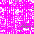
Based on Anikki, with some simplifications and modifications. I like Markavian's walls, so I did something similar. The bottom right tile, number 255, I use for pillars. You can set that in your d_init.txt, the line should look like [PILLAR_TILE:255]
Example.
|
|
|
|
| Title
|
[[#{{{filename}}}|{{{filename}}}]]
|
| Author
|
Paul
|
| Dated
|
2008-9-5
|
| Tile Size
|
10×10
|
| Resolution
|
800×250 for 80×25 grid size, others just multiply grid by 10.
|
| Versions
|
|
| Comments
|
Custom tileset I made for my own use when the adjustable grid sizes were released for DF. Some accented letters cut slightly to allow for larger letter display. Contains several of Tocky's tiles (barrels, some trees, dimple cups, coins, slightly modified armor stand). Others are either made by me or adjusted from curses_800x600 tiles.
|
|
|
|
| Title
|
[[#{{{filename}}}|{{{filename}}}]]
|
| Author
|
tejón
|
| Dated
|
2012-6-12
|
| Tile Size
|
10×10
|
| Resolution
|
800×250 @ 80×25.
|
| Versions
|
|
| Comments
|
The "full size" version of Potash. I insist on using a square font to maintain sanity when judging sizes and distances, but I'm not a fan of how text usually looks with square glyphs -- the letters are either too wide, or spaced too far apart. I've tried balance those two flaws against each other as much as possible, and I think this font is very readable as a result. Nearly all the 10×10 glyphs have empty borders on all four sides, to prevent confusing (or just ugly) connections between adjacent tiles.
|
|
|
|
| Title
|
[[#{{{filename}}}|{{{filename}}}]]
|
| Author
|
Taffer
|
| Dated
|
2017-01-10
|
| Tile Size
|
10×10
|
| Resolution
|
Looks decent at almost any resolution.
|
| Versions
|
|
| Comments
|
A sharp looking, vanilla styled tileset that strives to strike a good balance between nice, attractive graphics, while avoiding graphical oddities. I find the cumulative differences from the ASCII add to the game. Feel free to leave me a note. This has turned into a [1], and includes alternate walls, fonts, and racial graphics.
|
|
|
|
| Title
|
[[#{{{filename}}}|{{{filename}}}]]
|
| Author
|
Terbert
|
| Dated
|
2009-6-30
|
| Tile Size
|
10×10
|
| Resolution
|
800×250
|
| Versions
|
|
| Comments
|
This is Terbert's First tileset
|
|
|
|
| Title
|
[[#{{{filename}}}|{{{filename}}}]]
|
| Author
|
Tocky
|
| Dated
|
2007-11-15
|
| Tile Size
|
10×10
|
| Resolution
|
800×250 native, 800×500 for fullscreen.
|
| Versions
|
|
| Comments
|
I tried to make all the pictographic symbols as descriptive as possible: the only ones I've spotted that show up in odd places are the staircase symbols, '<' and '>', which are used as tags on barrel descriptions, and don't match -- but I'm willing to live with that in order to be able to tell up-stairs from down- ones. With everything else, I just tried to maximize clarity and readability and to keep them consistent. I'm really very pleased with how this set turned out.
|
|
|
11×11
|
| Title
|
[[#{{{filename}}}|{{{filename}}}]]
|
| Author
|
Gekz
|
| Dated
|
2010-1-08
|
| Tile Size
|
11×11
|
| Resolution
|
880×275
|
| Versions
|
|
| Comments
|
This works great on my EeePCs shoddy resolution of 1024x600, and this is why I made it. This is basically the Terminus font converted for use on DF. I chose this font due to its readability at a low resolutions, and soon I'll convert some of the non-letter characters into actually objects like bed | |
