- v50 information can now be added to pages in the main namespace. v0.47 information can still be found in the DF2014 namespace. See here for more details on the new versioning policy.
- Use this page to report any issues related to the migration.
Difference between revisions of "User talk:Stinkhorn"
m (→Translation sidebar positioning: typo) |
(enlarge images) |
||
| Line 7: | Line 7: | ||
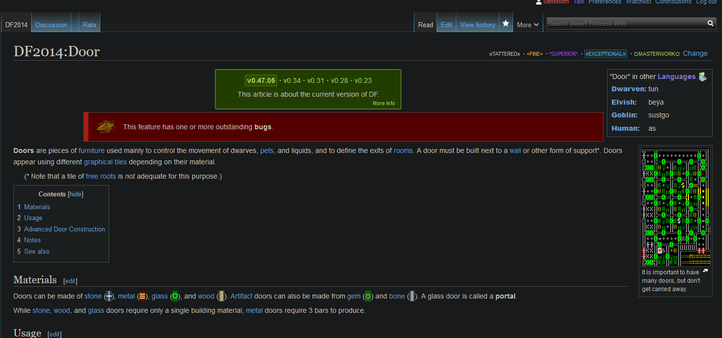
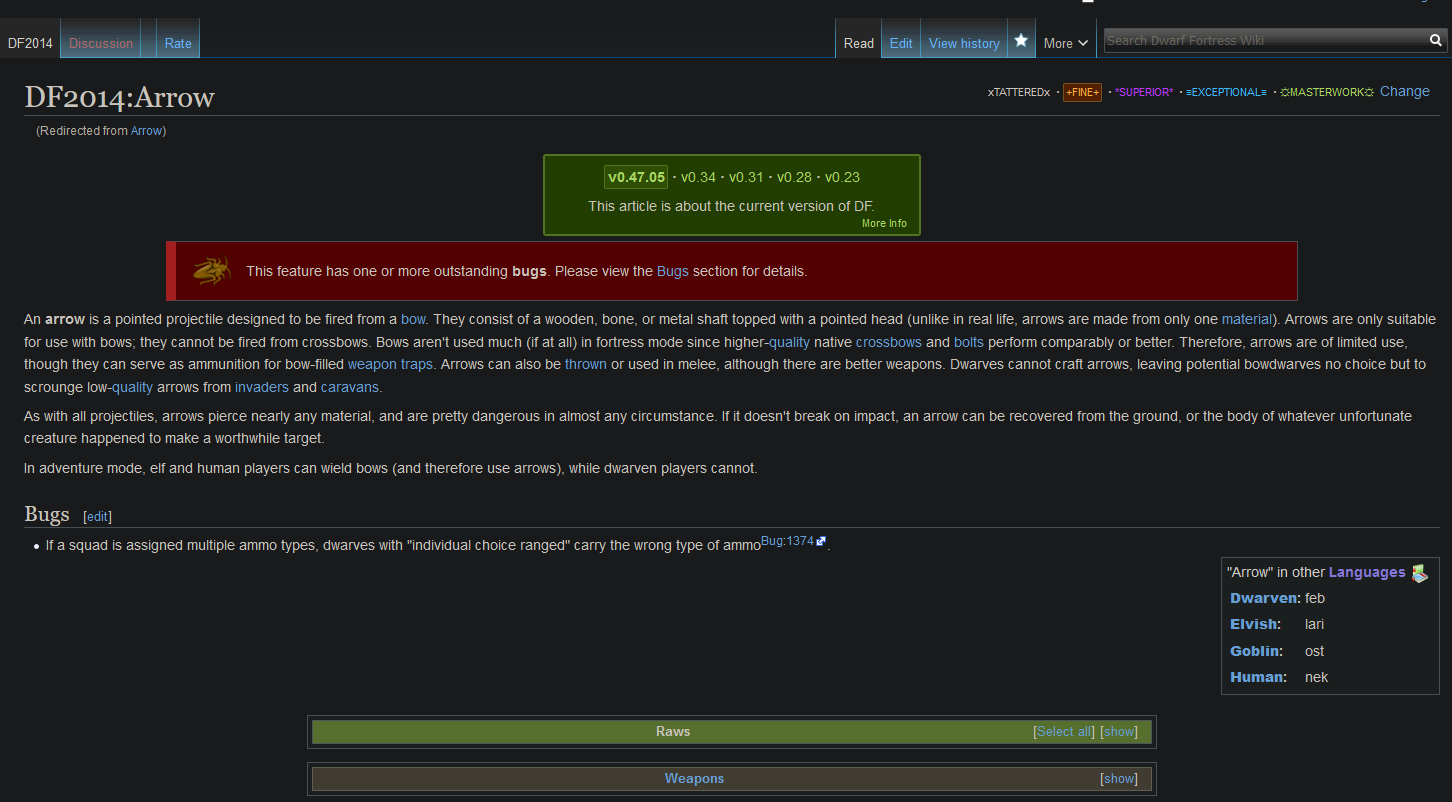
Yeah so, translation isn't important info, it's trivia. But it has a little graphical box that floats to the right effectively making a small sidebar, and having a little mini sidebar at the bottom of the screen is ugly and not helpful in my opinion. Especially have two sidebars is bad UI. Having it at the bottom with the raws also pushes the raws down weirdly and makes it look like part of the Bugs section. It's less in the way higher in the wiki where it's not displacing anything and can sit as a right sidebar | Yeah so, translation isn't important info, it's trivia. But it has a little graphical box that floats to the right effectively making a small sidebar, and having a little mini sidebar at the bottom of the screen is ugly and not helpful in my opinion. Especially have two sidebars is bad UI. Having it at the bottom with the raws also pushes the raws down weirdly and makes it look like part of the Bugs section. It's less in the way higher in the wiki where it's not displacing anything and can sit as a right sidebar | ||
| − | [[File:Top.png | + | [[File:Top.png|at the top]] |
| − | [[File:Bottom.png| | + | [[File:Bottom.png|at the bottom]] |
Revision as of 21:21, 29 January 2021
Translation sidebar positioning
Regarding some recent edits like [1] [2]: I think the original intention here was to have the translations lower down on the page because they're less important to the content of the article than the typical sidebar content - more along the lines of the creature raws and infoboxes at the bottom of each page. —Lethosor (talk) 04:28, 27 January 2021 (UTC)
How am I supposed to respond to this? I have the option to edit what you've said like this is a wiki page but no reply. Bizarre.
Yeah so, translation isn't important info, it's trivia. But it has a little graphical box that floats to the right effectively making a small sidebar, and having a little mini sidebar at the bottom of the screen is ugly and not helpful in my opinion. Especially have two sidebars is bad UI. Having it at the bottom with the raws also pushes the raws down weirdly and makes it look like part of the Bugs section. It's less in the way higher in the wiki where it's not displacing anything and can sit as a right sidebar

