- v50 information can now be added to pages in the main namespace. v0.47 information can still be found in the DF2014 namespace. See here for more details on the new versioning policy.
- Use this page to report any issues related to the migration.
Difference between revisions of "User:Sphr/gfx set"
| Line 296: | Line 296: | ||
|} | |} | ||
| − | === | + | ===Lava Creatures=== |
{| | {| | ||
|- style="background:lightgrey;" align="center" | |- style="background:lightgrey;" align="center" | ||
| − | | | + | | Lava creatures |
| − | + | Mk II. | |
| [[Image:Sphr_sample_fireman_fireimp_magmaman.png]] | | [[Image:Sphr_sample_fireman_fireimp_magmaman.png]] | ||
|} | |} | ||
Revision as of 14:03, 3 January 2008
Forward
(you can skip this part... really)
Some stuff about my gfx sets.
My guidelines in tile pixel art:
- Tiles should be distinguishable. Distinguishable != Different (!= means 'not equal', for those who are unfamiliar). Two tiles are different if at least one pixel at the same corresponding position has different value, but that doesn't mean the user can notice the difference when viewing it zoomed out at it's native 16x16 resolution on a 1280x400 window among many other tiles. As much as possible, I try to make my tiles distinguishable, through colors, more distinctive shapes (overlays) etc.
- Tiles should be intuitively recognizable. Just because tiles are distinguishable doesn't mean you know what it is without consulting some lookup-table or having to enter view unit mode to get more info. As much as possible, I try to make my tiles such that even if a person is looking at it for the first time, he or she can sort of guess what the tile represents and not be too surprised by the actual thing being represented.
- Lastly, as much as possible, tiles should be nice to look at. While this isn't a strict requirement like the previous two, I figure that nice-looking tiles -> nice-looking game -> happy players. I can't say that all my tiles look good (if any, since aesthetics are really subjective), but I try my best.
I may not always satisfy my own guidelines sufficiently all the time, given the large number of tiles that have to be produced for the gfx set to become usable at the basic level, but I keep the guidelines in mind whenever I do new tiles or remake old ones, when I find better ideas, since I AM producing it for my own benefit and use, motivation will lasts as long as I play the game. But since I find the gfx somewhat useful (could be subjective) I decided to start completing the basic tileset and share it, all in the hope of improving the experiences of some of the players/fans of ToadyOne and ThreeToe's amazing work.
If there are suggestions, especially on improving things according to my 3 guidelines (well, number 3 is a little subjective), please add to this page's discussion. But please do understand that this work is first and foremost meant for myself, so I may not (and will probably never) be able to accommodate all requests. But if I find feasible ideas that can be streamlined into my own goals, and that I can find time to do it, I will incorporate them. So please do not feel slighted/offended if I reject some ideas.
Race Sets
Similar to other List of user graphics sets, and discussion other items at Talk:List of user graphics sets.
Dwarves
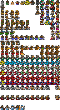
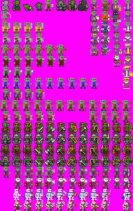
Version 0.9.1
v0.9.* is probably as high as the version can be for some time (less minor tweaks) as I have no immediate plans to do the only thing that is left : zombie and skeleton versions of the dwarves, since they aren't really used in the dwarf mode atm. When I muster the motivation to complete it, that will be the complete version v1.0.
Notes:
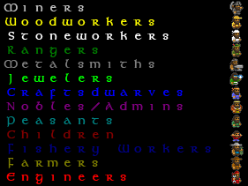
- in the last column (column 11), Veryinkey's Dystopian Qantas (v0.94) lists them from top down as COUNT, COUNT_CONSORT, BARON, BARON_CONSORT, DUKE, DUKE_CONSORT, KING, KING_CONSORT, which is strange because I thought it would be more natural if it followed an order of increasing rank (but Count is actually higher in rank to Baron). So in my work, I actually swapped position of BARON with COUNT and BARON_CONSORT with COUNT_CONSORT. The text data at the image's page differs from DQ's in this respect as well. But even without changes to text data, it should be fine as there is only one type of baron/count/duke at any point, if most people are like me who can't be bothered to distinguishing such nobles beyond that they are bags of troubles ;)
- I'm assuming that tile at 9:4 which was previously unreferenced refers to the CAPTAIN_OF_THE_GUARD. This is also recorded in the text data section, which is another area the text data differs from DQ's original.
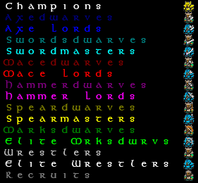
- (v0.9.1) After a couple of my guards reach champion status, I realised that they become indistinguishable from the controllable champions in the military. So I specialized them. For uniformity, all champions wear golden armor. Champion Fortress Guards wear red capes. Champion Royal Guards wear purple capes. Captain of the Guard now wears a blue cape. Normal champions stays the same (capeless). Unfortunately, this specialization means that I have to make some changes to DQ's organization. Although a copy of the champion tile is still kept at 0:5 for compatibility with DQ v0.94, the new designated positions for CHAMPION:DEFAULT is 0:12, CHAMPION:GUARD is 0:14 and CHAMPION:ROYALGUARD is 0:16 (occupies the free tile below that of RECRUIT:DEFAULT, RECRUIT:GUARD and RECRUIT:ROYALGUARD. And I'm also keeping the convention of controllable military units faces left, civilians and other non-controllable military units (guards/royal guards) faces right. Hopefully this helps in making it even more distinguishable. If the bitmap is simply copied over an existing DQ installation, it will still work, but you won't get the new champions guard/royal guard. To get them, you have to use the updated text data available on the image's page.
16x16 (targeting 1280x400)
For more details and installation instructions, see image page itself (click on image below).
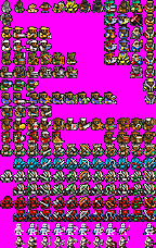
12x12 (targeting 960x300)
Still v0.9. Will update after collating more changes.
NOTE: Available at List of user graphics sets page in an easier to install form put together by Markavian.
This is automatically shrunk from the 16x16 versions with no manual tweaking. So some tiles may become recognizable/unusable. As this is a automatically derived version from 16x16 one, no direct support will be given for this version at this time as I don't want to maintain 2 different sets manually. Just providing an additional channel for people who wants 12x12 instead.
Also, if you think you have a better way of re-sampling the image, you can start from the original 16x16 version.
For the text data, refer to the one for 16x16, but change the line
[TILE_DIM:16:16]
to
[TILE_DIM:12:12]
. Everything else should be the same.
Sample Screenshots
(Only 16x16 versions are shown)
Disclaimer: Most of the following are real captures. A few are faked. Faked doesn't mean that it cannot be done in-game, just that I didn't want to spend the time to do that.
Goblins
Version 0.2
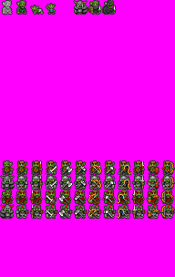
Just when I wanted to take a break, the goblins invade... Currently only do enough to handle goblin's invasion + goblin thieves. No ETA on future additions (on need basis).
Version 0.2 adds the "Blood Horns", the equivalent of the goblin's fortress guards, named for the red horns of their elite soldiers. Being not very particular about hygiene, Blood Horns often use actual blood to color their attire.
16x16 (targeting 1280x400)
For more details and installation instructions, see image page itself (click on one of the images below).
| Standalone update-friendly version | Dystopian Qantas v0.94 compatible version |
|
|
Sample Screenshots
(Only 16x16 versions are shown)
Elves
preview
Sample Screenshots
(Only 16x16 versions are shown)
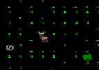
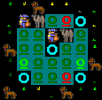
| Elven Traders on Bactrian Camels??? Maybe they came from the Desert...
Camels not included. |
|
Kobolds
preview
Sample Screenshots
(Only 16x16 versions are shown)
| Thief! Protect the hoard from the skulking filth!
Wait, the Fortress is THAT way... Leaving already??? Awwwww... my champions want to play with you.... |

|
Humans
Version 0.3
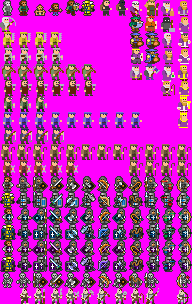
- I've finished the skeletons and elite skeletons, but I have not decided whether to put it up. The reason is that the original organization used by DQ only sets one row for skeletons. However, to cater for both normal and elite, I need two rows and have modified my local copy to reflect that. The row organization is the same as the other military (one row for normal weapons, one row for elite). Releasing this version will mean a break from the DQ compatibility goal which may make things difficult for current DQ users. I don't know what I'll do yet, prob wait and see. If anybody got good ideas, do tell me about them.
- 0.3 is first version made public. Now has merchants, peasant, child and all military, guards and royal guards.
16x16 (targeting 1280x400)
For more details and installation instructions, see image page itself (click on one of the images below).
| Dystopian Qantas v0.94 compatible version |
|
Sample Screenshots
(Only 16x16 versions are shown)
Others
Special occasions
Special tiles for special occasions. (No text data available as these are not meant for usual games, do your own merging.)
Christmas Special 2007
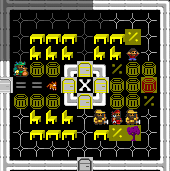
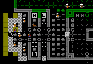
| A secret meeting between Darth Hammer and Santa-dwarf. A new conspiracy of the Empire?
Overheard: "shining bars... metal" "raw... crystal" "gems... shining" "focusing... light" "blade... red" |

|
| Mayor-pretending-to-be-Santa; Craftsdwarf-pretending-to-be-Santa's-Elf; Dog-pretending-to-be-reindeer. |
WIP Creatures
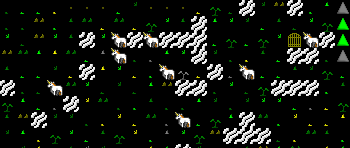
Unicorn Test
Not really planning to do animals yet, but there are unicorns on the current map I play... so....
| (placeholder); Adult unicorn; Child unicorn |
(placeholder is added because some systems uses top-left pixel to denote transparent colour and I used the top-left pixel for the Adult unicorn. Can be removed if Adult unicorn tile is not top-left tile in the actual bmp)
Domestic Animals
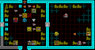
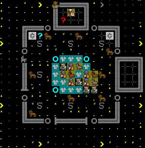
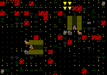
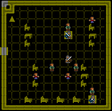
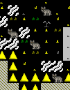
| Animals meeting in meeting zone. | 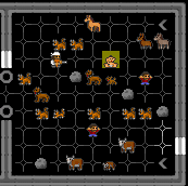
|
 |
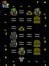
Row format: Adult; Child; (reserved for Zombie); (reserved for Skeleton); Hunting-trained; War-trained
Columns (top-down): DOG; CAT; COW; HORSE; MULE; DONKEY Sample text data on image's page. |
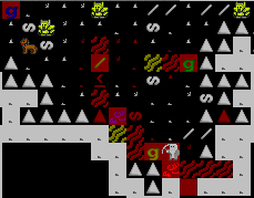
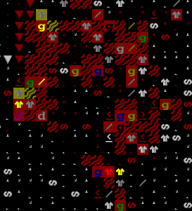
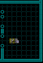
Lava Creatures
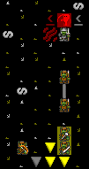
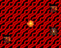
| Lava creatures
Mk II. |
|
Wildlife
Basically, I'm taking things slow and only stop to draw new animals when they actually appear in my current game. But after a while, I feel like a animal wildlife photographer! :) Just getting excited wondering what creature I'll see next (before they end up in the butcher's workshop...)
Hmmm. Thinking maybe I should turn off all hunting and pseudo-play a wildlife conservatory, by creating a large closed surface area safe from invasions and a way to "trick" animals to go in one-way and stay there...
Megabeasts/Semi-Megabeasts
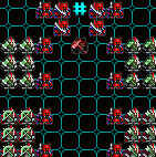
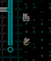
| The hydra, first of the Megabeasts Series. | 
|
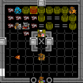
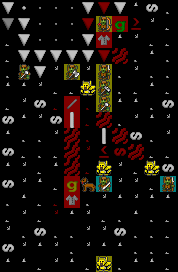
| Ettin in a tunnel. | 
|
