- v50 information can now be added to pages in the main namespace. v0.47 information can still be found in the DF2014 namespace. See here for more details on the new versioning policy.
- Use this page to report any issues related to the migration.
Difference between revisions of "User:Kydo"
| Line 1: | Line 1: | ||
| + | == Current Fortress == | ||
| + | |||
| + | === Preface: The World === | ||
| + | |||
| + | World Size: Large | ||
| + | Hstory: Very Long | ||
| + | Number of Civilizations: Very High | ||
| + | Maximum Number of Sites: Very High | ||
| + | Number of Beasts: Very High | ||
| + | Natural Savagery: Very High | ||
| + | |||
| + | Time Taken: 11:11 AM to 11:34 (23 minutes) | ||
| + | Rejected: 30 | ||
| + | |||
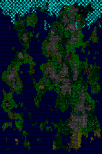
| + | Sil Gomath, "The Plane of Legends" | ||
| + | |||
| + | Year: 1,050 | ||
| + | Hist Figs: 206,114 | ||
| + | Dead: 196,504 | ||
| + | Events: 1,411,175 | ||
| + | |||
| + | [[Image:World_map-region2-1050--10081.gif|Thumb|200px]] | ||
| + | |||
| + | == Wiki Stuff == | ||
| + | |||
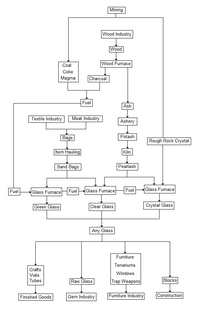
{{L|Glass Industry|Glass Industry Flowchart}} designed to replace the old one. Though it was a masterpiece of wiki-magic, it wasn't particularly in-depth, was a little vague, had a couple of inaccurate points, and kept breaking whenever anything changed. Thus, the logical solution is to replace it with a more comprehensive flowchart in the form of an image. Sadly, it's a little too literal, a little too... Blunt. It comes across as somewhat disorienting and menacing. It's a lot of tiny little things to look at, in order to fully interpret the whole... It reads like a schematic diagram of some ornate machine. If you have any ideas on how to make it appear friendlier, or read easier, please say something! I'd love to discuss it with you! | {{L|Glass Industry|Glass Industry Flowchart}} designed to replace the old one. Though it was a masterpiece of wiki-magic, it wasn't particularly in-depth, was a little vague, had a couple of inaccurate points, and kept breaking whenever anything changed. Thus, the logical solution is to replace it with a more comprehensive flowchart in the form of an image. Sadly, it's a little too literal, a little too... Blunt. It comes across as somewhat disorienting and menacing. It's a lot of tiny little things to look at, in order to fully interpret the whole... It reads like a schematic diagram of some ornate machine. If you have any ideas on how to make it appear friendlier, or read easier, please say something! I'd love to discuss it with you! | ||
| Line 6: | Line 31: | ||
[[Image:Glassflow2.png|Thumb|200px]] | [[Image:Glassflow2.png|Thumb|200px]] | ||
| − | |||
| − | |||
| − | |||
| − | |||
Revision as of 17:42, 24 October 2010
Current Fortress
Preface: The World
World Size: Large Hstory: Very Long Number of Civilizations: Very High Maximum Number of Sites: Very High Number of Beasts: Very High Natural Savagery: Very High
Time Taken: 11:11 AM to 11:34 (23 minutes) Rejected: 30
Sil Gomath, "The Plane of Legends"
Year: 1,050 Hist Figs: 206,114 Dead: 196,504 Events: 1,411,175
Wiki Stuff
Template:L designed to replace the old one. Though it was a masterpiece of wiki-magic, it wasn't particularly in-depth, was a little vague, had a couple of inaccurate points, and kept breaking whenever anything changed. Thus, the logical solution is to replace it with a more comprehensive flowchart in the form of an image. Sadly, it's a little too literal, a little too... Blunt. It comes across as somewhat disorienting and menacing. It's a lot of tiny little things to look at, in order to fully interpret the whole... It reads like a schematic diagram of some ornate machine. If you have any ideas on how to make it appear friendlier, or read easier, please say something! I'd love to discuss it with you!
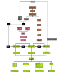
And a friendlier version for those of you who prefer to not be intimidated by blank white space.


