- v50 information can now be added to pages in the main namespace. v0.47 information can still be found in the DF2014 namespace. See here for more details on the new versioning policy.
- Use this page to report any issues related to the migration.
Difference between revisions of "User:Taffer"
| Line 4: | Line 4: | ||
<br /> | <br /> | ||
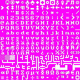
[[Image:Taffer 10x10.png|border|left]] | [[Image:Taffer 10x10.png|border|left]] | ||
| − | A tileset based on Tocky's tileset, but with tweaks to bring it closer to the original ASCII, as I was always put off by tiles appearing in improper places. Graphical backpack tiles will show up on the world map as large human towns, which bugged me | + | A tileset based on Tocky's tileset, but with tweaks to bring it closer to the original ASCII, as I was always put off by tiles appearing in improper places. Graphical backpack tiles will show up on the world map as large human towns, which bugged me. Walls that attempt to mimic a simple 3D look end up looking like odd looking rivers on the world map. Fancier little graphics always show up in unexpected places as they rarely are used for only one thing. I experienced similar issues with many other tilesets I tried. The result is a tileset that has the minimalism of Tocky's tileset, while retaining the purity of the original ASCII set. I don't foresee any remaining issues, unless an update messes something up. |
| − | The tileset is 90% Tocky, with a few tiles each from Vherid and Yayo, and one tile from Anikki | + | I did not do much original creation here, as I felt it hardly necessary. The tileset is 90% Tocky, with a few tiles each from Vherid and Yayo, and one tile from Anikki, so credit for the tiles go to these people. If you like it, feel free to leave me a message on my talk page. |
| − | Vherid's colour scheme is in turn based on Tocky's colour scheme, pictured and located [http://dwarffortresswiki.org/index.php/File:Df_tock10_1.PNG here]. | + | I highly recommend a better colour scheme. My preferred colour scheme is Vherid's Natural, from [http://www.bay12forums.com/smf/index.php?topic=89856.0 this] forum post. Vherid's colour scheme is in turn based on Tocky's colour scheme, pictured and located (with Tocky's tileset) [http://dwarffortresswiki.org/index.php/File:Df_tock10_1.PNG here]. The colours are darker and less vibrant than Vherid's scheme. You may prefer it. Vherid also has a number of other colour schemes, but I much prefer his Natural colour scheme, as it's the most vibrant, saturated one there. You can find some nice, less "brown" colour sets [http://dwarffortresswiki.org/index.php/DF2012:Color_scheme here]. |
Many good, stout dwarves died making the preview images. | Many good, stout dwarves died making the preview images. | ||
Revision as of 16:56, 29 March 2012
Taffer's tileset
/人◕ ‿‿ ◕人\
A tileset based on Tocky's tileset, but with tweaks to bring it closer to the original ASCII, as I was always put off by tiles appearing in improper places. Graphical backpack tiles will show up on the world map as large human towns, which bugged me. Walls that attempt to mimic a simple 3D look end up looking like odd looking rivers on the world map. Fancier little graphics always show up in unexpected places as they rarely are used for only one thing. I experienced similar issues with many other tilesets I tried. The result is a tileset that has the minimalism of Tocky's tileset, while retaining the purity of the original ASCII set. I don't foresee any remaining issues, unless an update messes something up.
I did not do much original creation here, as I felt it hardly necessary. The tileset is 90% Tocky, with a few tiles each from Vherid and Yayo, and one tile from Anikki, so credit for the tiles go to these people. If you like it, feel free to leave me a message on my talk page.
I highly recommend a better colour scheme. My preferred colour scheme is Vherid's Natural, from this forum post. Vherid's colour scheme is in turn based on Tocky's colour scheme, pictured and located (with Tocky's tileset) here. The colours are darker and less vibrant than Vherid's scheme. You may prefer it. Vherid also has a number of other colour schemes, but I much prefer his Natural colour scheme, as it's the most vibrant, saturated one there. You can find some nice, less "brown" colour sets here.
Many good, stout dwarves died making the preview images.
tl;dr
ლ(ಠ益ಠლ)
Just try the damn tileset and trust me. The colour scheme (Vherid's Natural) is important too. You taffer.

