- v50 information can now be added to pages in the main namespace. v0.47 information can still be found in the DF2014 namespace. See here for more details on the new versioning policy.
- Use this page to report any issues related to the migration.
Difference between revisions of "User:Taffer"
(→tl;dr) |
|||
| Line 4: | Line 4: | ||
<br /> | <br /> | ||
[[Image:Taffer 10x10.png|border|left]] | [[Image:Taffer 10x10.png|border|left]] | ||
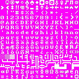
| − | A | + | A minimalist tileset designed as a "nicer ASCII". |
| + | |||
| + | I was always put off by tiles appearing in improper places. Graphical backpack tiles will show up on the world map as large human towns. Walls that attempt to mimic a simple 3D look end up looking like odd looking rivers on the world map. The list goes on, and because most tilesets try for a fancy aesthetic, they almost all end up having these little display bugs. Fancier little graphics always show up in unexpected places as characters are very rarely used for only one thing. The result is a tileset that is simple, easy to read, attractive, while retaining the purity and feel of the original ASCII. I've spent lots of time thinking over each tile, making sure everything doesn't just look nice, but fits well together. I think the result is sexy. | ||
| + | |||
| + | I highly recommend a better colour scheme than the default. My preferred colour scheme is Tocky's colour scheme, linked below. Vherid's colour schemes are worth looking into. You can find some nice, less "brown" colour sets on the wiki. Please visit the forum thread and leave a message if you like it, or have any comments! Alternate sets with nicer trees, gems, and dimple cups are in the forum thread as well. | ||
I highly recommend a better colour scheme than the default. My preferred colour scheme is [http://dwarffortresswiki.org/index.php/File:Df_tock10_1.PNG Tocky's colour scheme], previewed above. [http://www.bay12forums.com/smf/index.php?topic=89856.0 Vherid's colour schemes] are worth looking into. You can find some nice, less "brown" colour sets [http://dwarffortresswiki.org/index.php/DF2012:Color_scheme here]. Feel free to leave me a message on my user talk page, or on the [http://www.bay12forums.com/smf/index.php?topic=107924.0 forum thread] if you prefer. I'd love to hear from people who use it! | I highly recommend a better colour scheme than the default. My preferred colour scheme is [http://dwarffortresswiki.org/index.php/File:Df_tock10_1.PNG Tocky's colour scheme], previewed above. [http://www.bay12forums.com/smf/index.php?topic=89856.0 Vherid's colour schemes] are worth looking into. You can find some nice, less "brown" colour sets [http://dwarffortresswiki.org/index.php/DF2012:Color_scheme here]. Feel free to leave me a message on my user talk page, or on the [http://www.bay12forums.com/smf/index.php?topic=107924.0 forum thread] if you prefer. I'd love to hear from people who use it! | ||
| − | Many good, stout dwarves died making | + | Many good, stout dwarves died making this tileset. |
== Alternate version! == | == Alternate version! == | ||
Revision as of 18:15, 17 July 2012
Taffer's tileset
/人◕ ‿‿ ◕人\
A minimalist tileset designed as a "nicer ASCII".
I was always put off by tiles appearing in improper places. Graphical backpack tiles will show up on the world map as large human towns. Walls that attempt to mimic a simple 3D look end up looking like odd looking rivers on the world map. The list goes on, and because most tilesets try for a fancy aesthetic, they almost all end up having these little display bugs. Fancier little graphics always show up in unexpected places as characters are very rarely used for only one thing. The result is a tileset that is simple, easy to read, attractive, while retaining the purity and feel of the original ASCII. I've spent lots of time thinking over each tile, making sure everything doesn't just look nice, but fits well together. I think the result is sexy.
I highly recommend a better colour scheme than the default. My preferred colour scheme is Tocky's colour scheme, linked below. Vherid's colour schemes are worth looking into. You can find some nice, less "brown" colour sets on the wiki. Please visit the forum thread and leave a message if you like it, or have any comments! Alternate sets with nicer trees, gems, and dimple cups are in the forum thread as well.
I highly recommend a better colour scheme than the default. My preferred colour scheme is Tocky's colour scheme, previewed above. Vherid's colour schemes are worth looking into. You can find some nice, less "brown" colour sets here. Feel free to leave me a message on my user talk page, or on the forum thread if you prefer. I'd love to hear from people who use it!
Many good, stout dwarves died making this tileset.
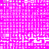
Alternate version!
Nothing to see here but solid walls. Move along. How do they see through the fortifications anyways?
tl;dr
ლ(゚Д゚ლ)
Just try the damn tileset and trust me. Tocky's colours are important too. You taffer.


