- v50 information can now be added to pages in the main namespace. v0.47 information can still be found in the DF2014 namespace. See here for more details on the new versioning policy.
- Use this page to report any issues related to the migration.
Difference between revisions of "User:Taffer"
| Line 6: | Line 6: | ||
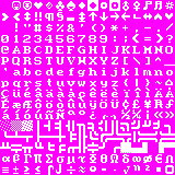
A minimalist tileset designed as a "nicer ASCII". | A minimalist tileset designed as a "nicer ASCII". | ||
| − | + | A sharp looking, vanilla styled tileset that strikes an excellent balance between nice, attractive graphics, while avoiding the odd graphical oddities that occur with many otherwise wonderful tilesets. Give one of my tilesets a good run. Credit to [http://atoji.deviantart.com/ Tocky], as the colours and base for the tileset are his, although I've diverged a fair amount from the original. This tileset started to address little annoyances that I felt with his otherwise wonderful little [http://dwarffortresswiki.org/index.php/Tileset_repository#Tocky tileset]. | |
| − | + | Featuring nicely rounded double lines for walls! Fortifications allow dwarves to peer through them! Cart tracks look like cart tracks! Or try the solid wall option for a cleaner look, and assume dwarves are using their x-ray vision on those solid looking fortifications. | |
| − | I | + | I've positioned many tiles carefully, and put a lot of thought into each one. Sometimes obsessively so. I've tried to stick closely to the default ASCII, but with nicer tiles. I find the cumulative differences make the game look much more attractive. Also, bearded voodoo soldier dwarves. Or just helmeted soldier dwarves, whichever you prefer. (This interpretation is suspect.) I'm a bit of a perfectionist and the update log attests to that, but the result is pleasing and well-polished. If you have any requests, let me know! This will work fine with any mods, unless the mod relies on graphic sets. |
| − | + | A change of the colour scheme is highly recommended, and my favoured scheme is [http://dwarffortresswiki.org/index.php/File:Df_tock10_1.PNG Tocky's colour scheme], featured above. More, decidedly [http://www.vgcats.com/comics/?strip_id=222 less brown] colour schemes can be found elsewhere [http://dwarffortresswiki.org/index.php/Color_scheme on the wiki]. Kindly let me know if anything looks off! Keep a weather eye open, as updates are likely to occur from time to time. Feel free to message me here with your queries, concerns, comments, or requests. I'll also be watching my [http://www.bay12forums.com/smf/index.php?topic=107924.0 thread], so don't hesitate to post there. | |
| + | |||
| + | I highly recommend [http://df.zweistein.cz/soundsense/ Soundsense], to provide your game with some more atmosphere. Barring that, dwarfy alternate background music can be found on [http://www.jtgibson.ca/df/ this] page, although it does get irksome after a while. A recommended mod is the [http://www.bay12forums.com/smf/index.php?topic=105871.0 Modest Mod], which almost exclusively fixes bugs. Taffers. | ||
== Alternate version! == | == Alternate version! == | ||
Revision as of 21:07, 24 October 2012
Taffer's tileset
/人◕ ‿‿ ◕人\
A minimalist tileset designed as a "nicer ASCII".
A sharp looking, vanilla styled tileset that strikes an excellent balance between nice, attractive graphics, while avoiding the odd graphical oddities that occur with many otherwise wonderful tilesets. Give one of my tilesets a good run. Credit to Tocky, as the colours and base for the tileset are his, although I've diverged a fair amount from the original. This tileset started to address little annoyances that I felt with his otherwise wonderful little tileset.
Featuring nicely rounded double lines for walls! Fortifications allow dwarves to peer through them! Cart tracks look like cart tracks! Or try the solid wall option for a cleaner look, and assume dwarves are using their x-ray vision on those solid looking fortifications.
I've positioned many tiles carefully, and put a lot of thought into each one. Sometimes obsessively so. I've tried to stick closely to the default ASCII, but with nicer tiles. I find the cumulative differences make the game look much more attractive. Also, bearded voodoo soldier dwarves. Or just helmeted soldier dwarves, whichever you prefer. (This interpretation is suspect.) I'm a bit of a perfectionist and the update log attests to that, but the result is pleasing and well-polished. If you have any requests, let me know! This will work fine with any mods, unless the mod relies on graphic sets.
A change of the colour scheme is highly recommended, and my favoured scheme is Tocky's colour scheme, featured above. More, decidedly less brown colour schemes can be found elsewhere on the wiki. Kindly let me know if anything looks off! Keep a weather eye open, as updates are likely to occur from time to time. Feel free to message me here with your queries, concerns, comments, or requests. I'll also be watching my thread, so don't hesitate to post there.
I highly recommend Soundsense, to provide your game with some more atmosphere. Barring that, dwarfy alternate background music can be found on this page, although it does get irksome after a while. A recommended mod is the Modest Mod, which almost exclusively fixes bugs. Taffers.
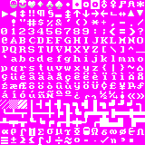
Alternate version!
Nothing to see here but solid walls. Move along. How do they see through the fortifications anyways?
tl;dr
ლ(゚Д゚ლ)
Just try the damn tileset and trust me. Tocky's colours are important too. You taffer.


