- v50 information can now be added to pages in the main namespace. v0.47 information can still be found in the DF2014 namespace. See here for more details on the new versioning policy.
- Use this page to report any issues related to the migration.
User:Kydo
Current Fortress
Title Page:
When I have something worthwhile hapen, I'll do a drawing for a genuine cover, and give it an appropriate title.
Preface:
I have an idea for a DF-inspired work of fiction. DF is un on it's own, but it's when we get to telling stories about what we've seen and done that things really get entertaining. Most of us got pulled in by the stories of Boatmurdered, and that was done in an OLD version of the game!But I believe we can do better. Pretty much all of the DF witing I've read is either D for Dwarf content on the wiki, or written from the perspective of the player, frequently as the "leader" of the fortress. I want to do something different. I want to explore, from a first-person perspective, the lives of the dwarves, in close detail. What's it like for seven-year-old Medtobonul, wandering stone halls and observing statues of his grandparents being eviscerated by demons? I don't want there to be a single narrative, that would just be too isolated, it wouldn't really give the full scope impression of all the life in a given fortress. Rather, there shall be many narratives. Bits and scraps, lik bitof old jounals, engravings on walls... Sort of like ghosts or memories of somthing huge, something grand. Something deeper than just a simple (and violent) game. I want to tell storis about the down time, the (currently) non-existent barroom conversations, the travelling, the politics... Not just the horrible accidents.
Wiki Stuff
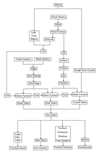
Glass Industry Flowchart designed to replace the old one. Though it was a masterpiece of wiki-magic, it wasn't particularly in-depth, was a little vague, had a couple of inaccurate points, and kept breaking whenever anything changed. Thus, the logical solution is to replace it with a more comprehensive flowchart in the form of an image. Sadly, it's a little too literal, a little too... Blunt. It comes across as somewhat disorienting and menacing. It's a lot of tiny little things to look at, in order to fully interpret the whole... It reads like a schematic diagram of some ornate machine. If you have any ideas on how to make it appear friendlier, or read easier, please say something! I'd love to discuss it with you!
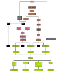
And a friendlier version for those of you who prefer to not be intimidated by blank white space.
I am planning on revising the new glass industry flow chart to show literal interactions, eliminate flow line crossovers, and establish a unidirectional flow, all for clarity.

