- v50 information can now be added to pages in the main namespace. v0.47 information can still be found in the DF2014 namespace. See here for more details on the new versioning policy.
- Use this page to report any issues related to the migration.
User:Alloy
Contributions[edit]
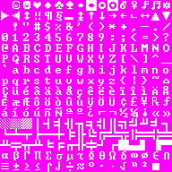
I 'made' a curses_12x12 tileset, because I like the unaltered classic look, but after four years of playing at a 2:3 aspect ratio and finding every curses tileset had alterations, I finally broke down and made the one I wanted myself.
I tried to keep it consistent with the original's positioning of items for consistency. Letters, numbers and most things that are not just pure symbols are biased to the left of their tile so text looks evenly-positioned. The walls and other 'line' tiles all use two pixel-thick lines, and I really don't understand why the original doesn't do it that way, but no matter. The circle and double note look nicer when they're not squashed up, too. (I left the stone as an oval because it just doesn't look right otherwise, what can you do.)
