- v50 information can now be added to pages in the main namespace. v0.47 information can still be found in the DF2014 namespace. See here for more details on the new versioning policy.
- Use this page to report any issues related to the migration.
User:Sphr/gfx set
You may be looking for general information on tilesets, List of user character sets or List of user graphics sets.
Download
In addition to the raw images and text data, a snapshot of the actual gfx/char tilesets that I am using is now available at here for download. All the files are the actual files I'm using for the game, so it's ready for direct use. Available at version 2 -- 07:11, 12 August 2008 (EDT)
Read Me
- I've been sparse with the manual installation instructions, as I assume that the reader knows the basics of fiddling with custom gfx tiles. The basic instructions are shown on the wiki page on tilesets as well as in several forum posts by helpful individuals (which should be stickied, or at least have the content copied over to the wiki). {TODO: put links to forum posts here?} If you really don't feel like putting in the effort, I think there are several nice compilations that are easier to install, which packs the actual BMP and TXT files nicely in an archive which you can just replace the entire raw/graphics in DF directory.
- The text data for the gfx tile pages are usually stored on wiki page of the image itself (just click on a tile page image to see the wiki page for that image). If you don't know what I'm talking about, go to previous bullet ;)
- If you discovered any problems with the image or the text data, please put it down in the Talk Page and I'll fix problems in time.
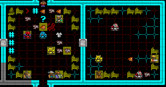
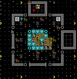
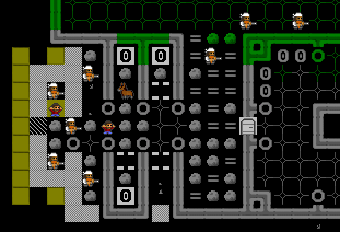
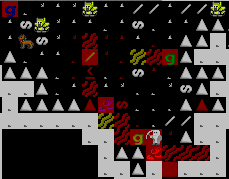
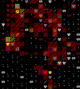
- Btw, here's an example of my gfx set working with a new tilset, which is based on SL's tileset (based partially off Guybrush and Flying Mage) with lots of modified elements mainly from Red Jack. I've completely reworked some of the tiles and created some original ones too replace those I can't find one to my liking. See Sample Maps for link.
Recent News
- Character set: updated to v2. Mainly fix terrain which are too bright against trees and made bins appear as separate boxes. -- 06:56, 12 August 2008 (EDT)
- Finally got my hands dirty with character set. Result is here.
- Humans : updated to v0.6. Triggered by a visit from a Human Guild Representative whose tile I was lacking, this round of update includes some nobles/admin and default tiles for generic labor. -- 10:05, 3 August 2008 (EDT)
- Added a mini tile page for Kobolds. -- 09:25, 2 August 2008 (EDT)
- Added Standard Creatures and updated Dwarves secretly and quietly...
- Gods... have been missing for almost a month.... some important design work came up which has a tight deadline complicated with some health problems. I have not been able to do any gfx work (can't even find time to play..... *sob*) but I still have some unreleased creature tiles which I'll try to put up by today (if I can sort it out when I take another break).
- Subterranean Creatures. : uploaded v1.0 -- 10:55, 10 January 2008 (EST)
- Humans : updated to v0.5, added skeletons. -- 10:21, 5 January 2008 (EST)
- Domestic Animals : uploaded v1.0. -- 05:02, 5 January 2008 (EST)
- Tundra Animals : updated to v1.1, fixed an alignment problem for polar bear tiles. -- 03:25, 5 January 2008 (EST)
- Tundra Animals. : uploaded v1.0 -- 12:50, 4 January 2008 (EST)
Introduction
(you can skip this part... really)
My Guidelines
My guidelines in tile pixel art:
- Tiles should be distinguishable. Distinguishable != Different (!= means 'not equal', for those who are unfamiliar). Two tiles are different if at least one pixel at the same corresponding position has different value, but that doesn't mean the user can notice the difference when viewing it zoomed out at it's native 16x16 resolution on a 1280x400 window among many other tiles. As much as possible, I try to make my tiles distinguishable, through colors, more distinctive shapes (overlays) etc.
- Tiles should be intuitively recognizable. Just because tiles are distinguishable doesn't mean you know what it is without consulting some lookup-table or having to enter view unit mode to get more info. As much as possible, I try to make my tiles such that even if a person is looking at it for the first time, he or she can sort of guess what the tile represents and not be too surprised by the actual thing being represented.
- Lastly, as much as possible, tiles should be nice to look at. While this isn't a strict requirement like the previous two, I figure that nice-looking tiles -> nice-looking game -> happy players. I can't say that all my tiles look good (if any, since aesthetics are really subjective), but I try my best.
I may not always satisfy my own guidelines sufficiently all the time, given the large number of tiles that have to be produced for the gfx set to become usable at the basic level, but I keep the guidelines in mind whenever I do new tiles or remake old ones, when I find better ideas, since I AM producing it for my own benefit and use, motivation will lasts as long as I play the game. But since I find the gfx somewhat useful (could be subjective) I decided to start completing the basic tileset and share it, all in the hope of improving the experiences of some of the players/fans of ToadyOne and ThreeToe's amazing work.
If there are suggestions, especially on improving things according to my 3 guidelines (well, number 3 is a little subjective), please add to this page's discussion. But please do understand that this work is first and foremost meant for myself, so I may not (and will probably never) be able to accommodate all requests. But if I find feasible ideas that can be streamlined into my own goals, and that I can find time to do it, I will incorporate them. So please do not feel slighted/offended if I reject some ideas.
What am I up to now?
- Up to the neck with work. Stealing a moment to have a little fun. But DF's too addictive for a 'little' fun.
Acknowledgements
- As many tiles as I've done, there are still so many more tiles to do to make certain tile pages complete. I'm still using Dystopian Rhetoric tiles myself (those included in DQ) for all those I've not done, as DR is still the most complete set ever (kinda like the MS Arial Unicode among fonts). Only when I started drawing gfx tiles can I truly appreciate just how big the task must have been for DR to put up a complete gfx set. Despite the fact that I'm sort of a "competitor" now in some people's perceptions, my aim is first and foremost trying to improve my own game experience (and hopefully others' too, along the way), and being a long time DR gfx tiles user myself, I have nothing less than utmost appreciation for what he'd done. *salutes*
- Veryinky well deserves a mention too, for organizing all those gfx tiles in a sensible and modular manner so that it becomes much easier for people (like me) to update/maintain them. The organization is based on the raw files organization of the original game itself, so correspondence for modders is easier (e.g. if people add new creature raw, they can add new creature gfx without disturbing the rest using the same pattern). If it isn't for his organization, I think I would never have gotten the motivation to produce more tiles and make them public (under the pressure that one has to make a whole complete set of tiles for all creatures to "publish" them). *salutes*
Race Sets
Similar to other List of user graphics sets, and discussion other items at Talk:List of user graphics sets.
Dwarves
Version 0.9.2
v0.9.* is probably as high as the version can be for some time (less minor tweaks) as I have no immediate plans to do the only thing that is left : zombie and skeleton versions of the dwarves, since they aren't really used in the dwarf mode atm. When I muster the motivation to complete it, that will be the complete version v1.0.
Notes:
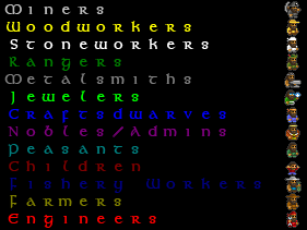
- (v0.9.2) Added new icons for PRIEST(10:6), HIGH_PRIEST(10:7), SLAVE(7:1) and PRISONER(7:2). SHOPKEEPER reuses TRADER icon (8:2)
- in the last column (column 11), Veryinky's Dystopian Qantas (v0.94) lists them from top down as COUNT, COUNT_CONSORT, BARON, BARON_CONSORT, DUKE, DUKE_CONSORT, KING, KING_CONSORT, which is strange because I thought it would be more natural if it followed an order of increasing rank (but Count is actually higher in rank to Baron). So in my work, I actually swapped position of BARON with COUNT and BARON_CONSORT with COUNT_CONSORT. The text data at the image's page differs from DQ's in this respect as well. But even without changes to text data, it should be fine as there is only one type of baron/count/duke at any point, if most people are like me who can't be bothered to distinguishing such nobles beyond that they are bags of troubles ;)
- I'm assuming that tile at 9:4 which was previously unreferenced refers to the CAPTAIN_OF_THE_GUARD. This is also recorded in the text data section, which is another area the text data differs from DQ's original.
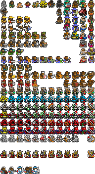
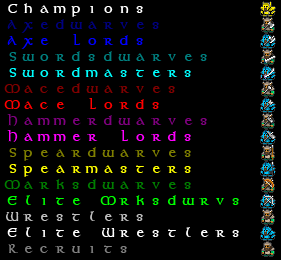
- (v0.9.1) After a couple of my guards reach champion status, I realised that they become indistinguishable from the controllable champions in the military. So I specialized them. For uniformity, all champions wear golden armor. Champion Fortress Guards wear red capes. Champion Royal Guards wear purple capes. Captain of the Guard now wears a blue cape. Normal champions stays the same (capeless). Unfortunately, this specialization means that I have to make some changes to DQ's organization. Although a copy of the champion tile is still kept at 0:5 for compatibility with DQ v0.94, the new designated positions for CHAMPION:DEFAULT is 0:12, CHAMPION:GUARD is 0:14 and CHAMPION:ROYALGUARD is 0:16 (occupies the free tile below that of RECRUIT:DEFAULT, RECRUIT:GUARD and RECRUIT:ROYALGUARD. And I'm also keeping the convention of controllable military units faces left, civilians and other non-controllable military units (guards/royal guards) faces right. Hopefully this helps in making it even more distinguishable. If the bitmap is simply copied over an existing DQ installation, it will still work, but you won't get the new champions guard/royal guard. To get them, you have to use the updated text data available on the image's page.
16x16 (targeting 1280x400)
For more details and installation instructions, see image page itself (click on image below).
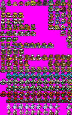
12x12 (targeting 960x300)
Still v0.9. Will update after collating more changes.
NOTE: Available at List of user graphics sets page in an easier to install form put together by Markavian.
This is automatically shrunk from the 16x16 versions with no manual tweaking. So some tiles may become recognizable/unusable. As this is a automatically derived version from 16x16 one, no direct support will be given for this version at this time as I don't want to maintain 2 different sets manually. Just providing an additional channel for people who wants 12x12 instead.
Also, if you think you have a better way of re-sampling the image, you can start from the original 16x16 version.
For the text data, refer to the one for 16x16, but change the line
[TILE_DIM:16:16]
to
[TILE_DIM:12:12]
. Everything else should be the same.
Sample Screenshots
(Only 16x16 versions are shown)
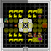
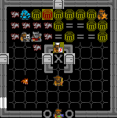
Disclaimer: Most of the following are real captures. A few are faked. Faked doesn't mean that it cannot be done in-game, just that I didn't want to spend the time to do that.
Goblins
Version 0.2
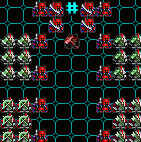
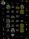
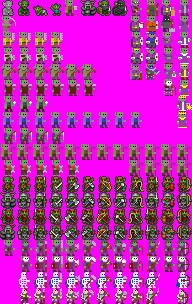
Just when I wanted to take a break, the goblins invade... Currently only do enough to handle goblin's invasion + goblin thieves. No ETA on future additions (on need basis).
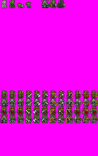
Version 0.2 adds the "Blood Horns", the equivalent of the goblin's fortress guards, named for the red horns of their elite soldiers. Being not very particular about hygiene, Blood Horns often use actual blood to color their attire.
16x16 (targeting 1280x400)
For more details and installation instructions, see image page itself (click on one of the images below).
| Standalone update-friendly version | Dystopian Qantas v0.94 compatible version |
|
|
Sample Screenshots
(Only 16x16 versions are shown)
Elves
preview
Sample Screenshots
(Only 16x16 versions are shown)
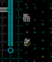
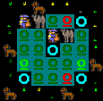
| Elven Traders on Bactrian Camels??? Maybe they came from the Desert...
Camels not included. |
|
Kobolds
minipack Version 0.1
A minipack consists of basic kobold tiles, namely STANDARD, CHILD, THIEF, MASTER_THIEF and some basic military: RECRUIT, WRESTLER, SPEARMAN, SWORDSMAN and their elite counterparts.
16x16 (targeting 1280x400)
For more details and installation instructions, see image page itself (click on one of the images below).
Sample Screenshots
(Only 16x16 versions are shown)
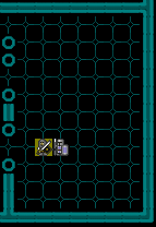
| Thief! Protect the hoard from the skulking filth! | 
|
Humans
Version 0.6
Note: I am too lazy to update the dyc version. Blame me.
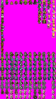
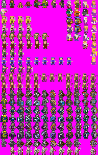
- 0.6 adds some site office holders (this update is triggered by a GUILDREP visiting my fortress actually). Added tiles for generic labor types. Unintentionally contains several under-testing zombie icons (lazy to remove). NOTE: There is a change in text data from 0.5, mainly to remove all the duplicated labor tiles, so please remember to update the text data in addition to updating the graphics file.
- 0.5 adds skeletons and elite skeletons. Elite skeletons only available in the non DQ compatible one as it requires extra rows.
- I've finished the skeletons and elite skeletons, but I have not decided whether to put it up. The reason is that the original organization used by DQ only sets one row for skeletons. However, to cater for both normal and elite, I need two rows and have modified my local copy to reflect that. The row organization is the same as the other military (one row for normal weapons, one row for elite). Releasing this version will mean a break from the DQ compatibility goal which may make things difficult for current DQ users. I don't know what I'll do yet, prob wait and see. If anybody got good ideas, do tell me about them.
- 0.3 is first version made public. Now has merchants, peasant, child and all military, guards and royal guards.
16x16 (targeting 1280x400)
For more details and installation instructions, see image page itself (click on one of the images below).
| new organization | Dystopian Qantas v0.94 compatible version (not updated) |
|
|
Sample Screenshots
(Only 16x16 versions are shown)
Animal Sets
Domestic Animals
v1.0
For more details and installation instructions, see image page itself (click on image below).

|
DOG CAT COW HORSE MULE DONKEY |
Sample Screenshots
(using 16x16 tiles)
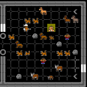
| Domestic animals at a meeting zone.
Featuring cats Mk2. |
|
Tundra Animals
v1.1
For more details and installation instructions, see image page itself (click on image below).
| MUSKOX ELK BEAR_POLAR |
Sample Screenshots
(using 16x16 tiles)
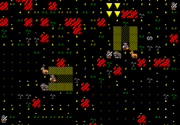
| Muskox pulling a merchant's wagon. | |
| Elk seen on outskirts of human town. | 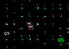
|
| (Reserved for polar bear) | (don't have it yet) |
Subterranean Creatures
v1.0
For more details and installation instructions, see image page itself (click on image below).
Sample Screenshots
(using 16x16 tiles)
Standard Creatures
v1.0
For more details and installation instructions, see image page itself (click on image below).
Sample Screenshots
(using 16x16 tiles)
Others
Special occasions
Special tiles for special occasions. (No text data available as these are not meant for usual games, do your own merging.)
Christmas Special 2007
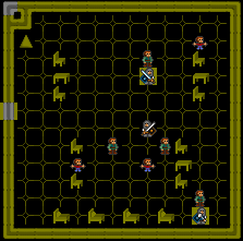
| A secret meeting between Darth Hammer and Santa-dwarf. A new conspiracy of the Empire?
Overheard: "shining bars... metal" "raw... crystal" "gems... shining" "focusing... light" "blade... red" |

|
| Mayor-pretending-to-be-Santa; Craftsdwarf-pretending-to-be-Santa's-Elf; Dog-pretending-to-be-reindeer. |
WIP Creatures
Wildlife
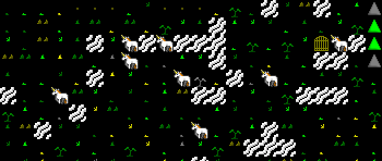
Basically, I'm taking things slow and only stop to draw new animals when they actually appear in my current game. But after a while, I feel like a animal wildlife photographer! :) Just getting excited wondering what creature I'll see next (before they end up in the butcher's workshop...)
Hmmm. Thinking maybe I should turn off all hunting and pseudo-play a wildlife conservatory, by creating a large closed surface area safe from invasions and a way to "trick" animals to go in one-way and stay there...
Character Tileset
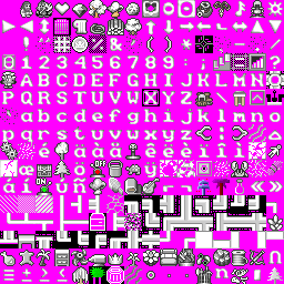
Sphr's square 16x16 mix version 0.3 updated 11:00, 12 August 2008 (EDT)
This is the tileset that I've put together from many different sources. Based off SL's work (which in turn is based off other tilesets like GuyBrush and Flying Mage). I also borrowed many tiles from Red Jack's Nintendo set to replace some of the oblique view tiles, modifying quite a number of them. Also did my own share of original work in addition to some of the modifications.
It is done with the intention of preserving the text as much as possible, but I had to sacrifice some of the punctuations. But I see this as interim... after all, there's the Presentation Arc...
For installation, see the instructions on the tileset page. It is also highly recommended to use Accent Removal, to make your text sane.
For sample, see the Sample Maps section.
For the colour scheme I use, see the image page itself.
Sample Maps
- Steelfortress - 44 Late Spring - shows the major overhaul when I get my hands dirty with character set.
Director's Cut
This is not a "release". It's a "director's cut" of the actual files (gfx and char tilesets) I'm using (unmodified). It consists of more than just my own work so credits goes to their original creators (mainly DR) as well. Use of this is up to individual and I will not bear responsibility for anything broken.
Please read the "sphr_readme.txt" in the main directory within the archive for more details. SphrDirectorsCut39e.zip
