- v50 information can now be added to pages in the main namespace. v0.47 information can still be found in the DF2014 namespace. See here for more details on the new versioning policy.
- Use this page to report any issues related to the migration.
User:Shaja
Plans changed, of course.
Regular OS or Photoshop-rendered grey-scale antialiasing just does not look good in Dwarf Fortress when the character cell background is inverted, since the characters have only a one-bit alpha mask.
I love Consolas, but it is totally not designed for non-Cleartype rendering.
The Microsoft Glass Gauge font from Flight Simulator was ok, but was composed of too many 45 degree angles for me to really like.
After a lengthy period of casting about for a fixed-pitch font that worked at the relatively high point size I wanted, I finally found Dimitar Zhekov's Terminus font, which looked almost right to me.
I also appropriated some characters faces that I think make nice not-quite-standard dwarves from The Boukagne's Font, by PRS.
So, after a lot of fiddling around in Photoshop on my PC, and Pixen on my Mac, I realized that neither PS nor Pixen worked very well for what I was doing. Good thing I found GraphicsGale, which is nearly perfect.
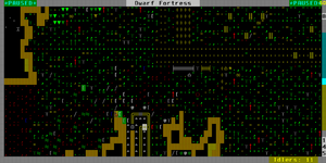
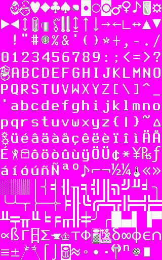
In the end, I hand-edited every alpha character used from Terminus, adding some slight antialiasing shading towards the upper end of the brightness scale - looks much better than no antialiasing with dark cell backgrounds, but still looks pretty good with inverted colors like the Dwarf Fortress frame title.
I also redid walls and some of the symbol characters, but there are still quite a few left from the base I used, 'Curses_24pt_cleartype_ThomModifications' (which was itself based on a set by Winterwing, which I've never seen).
And here is the result:
--Shaja 23:15, 27 March 2008 (EDT)
9 March 2008
Hello, world.
I'm working on some 20x32 character sets - an antialiased set using Consolas, and an aliased set using Microsoft's Glass Gauge font, slightly tweaked.
Why 20x32? Because I use a 1600x1200 monitor, and none of the current fonts have quite what I like (although I am of course using other people's characters in many spots).


