- v50 information can now be added to pages in the main namespace. v0.47 information can still be found in the DF2014 namespace. See here for more details on the new versioning policy.
- Use this page to report any issues related to the migration.
DF2014:Bedroom design
| This article is about an older version of DF. |
There are many ways to design the layout of bedrooms. Simplicity, ease of designating, efficiency, and aesthetics are all important factors in designing dwarven housing. The ability to modify the design to enlarge, improve, or add rooms can be important as well. Proximity of the rooms to noise should also be considered.
As to size, all a dwarf needs to sleep is a 1-tile bed, anywhere. However, to be happy, a dwarf wants their own room with a bed, and a chest and a cabinet to put stuff in. Dwarves consider it a bonus if the room is enclosed by 4 walls (or 3 and a door) for privacy. If you want to add some other item(s) that a dwarf prefers to add to their happiness, that would require that much more space - usually no more than a tile or two. However, some nobles can get very particular, and their rooms need to be bigger to meet all their requirements.
The simplest approach resolving dwarven sleeping requirements is to have all your dwarves sleep in a large communal dormitory. The smallest bedroom design possible is a corridor with notched spaces for beds.
Players frequently want designs which maximize positive thought and minimize the path distance between a dwarf's food, drink, job and home. For these purposes, nothing holds a candle to the ease, simplicity, and efficiency of overlapping bedrooms in a single large, carved-out area. In the current version, the main benefits of individualized rooms are for roleplaying purposes. Historically, room design was further complicated when the dwarven economy kicked in, and a wide range of "room qualities" were needed, and poor dwarves were kicked out of over-priced quarters (the dwarven economy is currently disabled). To this end, a number of solutions, some surprisingly elegant, have been produced.
Many of the designs shown here were taken from this forum post.
Minimalism
Sometimes, simpler is better... not always, but sometimes...
1x1 bed only, no walls
By far the most minimal design is to take a bed, place it anywhere you want, then set it as a 1x1 room. This bed 'room' can be assigned to a dwarf early on, and will at least serve the bare minimum purpose of avoiding unhappy thoughts from the lack of a room. It will not, of course, leave the dwarves with any space to store any possessions at all. However, it requires the absolute minimum work to set up; all you need is existing empty space, preferably with no noise nearby, and a bed to place in it.
Alternatively if you are building compact merely to save space or improve framerate, a 1x1 bedroom on a smoothed, engraved floor can have quite a high room value.
Note that since beds do not block movement and simply having people moving nearby (or even directly over them) does not produce noise or disrupt sleeping dwarves in any way, you can place these 1x1 rooms in a solid block with no space between them; this makes it easy to smooth and engrave the floor for all of them at once. With a competent engraver and quality beds, this is often enough to raise the room value to the point where even this minimalist setup will produce happy thoughts; compared to a high-quality bed, the amount that un-engraved walls would add to a room's value is minimal anyway.
Communal dormitory
The simplest form of dwarven housing. Stick a bunch of beds in a room, designate a dormitory from one of them (do not assign the bed to anyone), and voilà, instant flophouse. On maps with no trees, this is pretty much your only option for sleeping quarters before breaching a cavern or importing large amounts of wood. (Dwarves will sleep on the floor of the dormitory if no beds are available, which at least keeps them from sleeping in the wilderness.)
This setup only causes a single negative thought ("slept without a proper room recently"), although you miss out the benefit of the happy thoughts generated by personally-owned furniture. However, as long as you compensate by offering your dwarves high-quality food and alcohol, an expansive dining room, and other luxuries, your dwarves will remain happy enough to be productive throughout the life of a fortress. (You may still wish to give nobles their own rooms, however; they tend to get upset when their requirements are not met)
More than one dormitory can be built in a fortress; if they do not own their own bedroom, dwarves will gravitate to a nearby empty bed when it is time for them to sleep.
Communal dormitories are more appealing now due to the presence of vampires among fortress populations, as it increases the likelihood of the offending bloodsucker being caught.
Note that compared to the solid block of 1x1 bedrooms above, the only advantage to a communal dormitory is the ease with which it can be set up - even owning a 1x1 room generates happy thoughts (as opposed to the minor negative one from a dormitory) and take the exact same space. Therefore, if unhappy thoughts are a concern, you should designate the beds as rooms instead.
Plain square design
If it is 2×2, 3×3 or more, square designs are probably the first choice of many players. Easy to plan, easy to put in place, this kind of design is one of the best when the player values their playing time instead of the overall layout of their fortress. While square designs are easy to reproduce en masse, most are not optimized either for beauty or space efficiency, two aspects that other designs excel at.
Line design
Line designs have the advantage of being very space efficient and very adaptative. From 1×1 to 1×4 and longer, it can fit almost anywhere, can be upgraded later on as long as you have the space behind your first original line and do not need excessive corridor space for the bedroom access. Simply dig a few lines out of an access tunnel already in use in your fortress and voilà, you have new living quarters. This kind of minimalistic design was particularly useful when the economy kicked in, as it could be adapted in a flash to meet the needs of low-wage citizens.
Decentralized living
In larger fortresses, one of the bigger problems is traffic. Dwarves have a tendency to all get hungry, thirsty, and tired in waves, and a crowd of 50 of them storming your centralized food stockpiles, one big dining room, and dormitory tunnels can cause a lot of lost time while the hordes shuffle by each other. A good solution to this is decentralized architecture, incorporating most of the essentials of every day life into numerous smaller areas. This isn't to suggest that you shouldn't have a legendary dining hall set as a meeting area, capable of holding half your fortress at once. You definitely should! But decentralizing from that dining hall relieves a lot of congestion in the halls surrounding the main dining hall, and makes it easier for dwarves just to pass through.
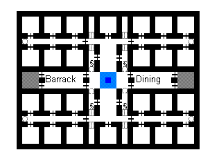
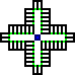
In this image, the access stairwell (blue fields in the center), spread out in all directions to a public dormitory and dining room for poorer dwarves on the left/right and to 3x3 private rooms on the top/bottom. The design allows for two small stockpiles of food (gray fields) to minimize the walk to a dining hall.
There are also built-in areas for impressive things like statues and cages (for zoos) to keep dwarves admiring your handiwork. The 3x3 rooms are easy to get up to decent or higher to keep your most useful dwarves happy as clams. They're also convenient for impromptu noble housing, since you can just knock out a wall between two rooms and convert one into a dining room for a whiny noble. You could even expand the corner rooms a bit more on both the X and Y axes to make four 3x3 rooms to give the noble a dining room, tomb, and office all in one area. This is especially useful for the mayor, who gets replaced every so often. When a new Mayor is elected, one can reassign all the trappings to the new mayor in one go. If you want an even more decentralized and calm traffic pattern, put tables and chairs in all the private rooms; dwarves will prefer to eat in their quarters. The walls between the doors leading to the dormitory and Dining Room allow for 2 entrances and 2 exits to each predictably higher-traffic room while leaving a pillar of rock for an engraving. The main corridor also allows you to branch off into 4 restraints per floor in a private 1x2 prison. Since it's flanked by an animal cage and a statue (or alternatively, 2 statues. This may be better because Statues block movement and it's effectively the same as surrounding the prisoner with walls). Additionally, in an area you want smoothed and engraved to begin with, it gives prisoners a leg upon their happiness immediately and -- once again -- prevents traffic jams from convicts being brought food and water in larger prisons.
Another option for maximizing traffic throughput is to put a 1x3 line of upward stairwells on one end of the blue field, and a 1x3 line of downward stairwells on the other. This simulates a 3-wide vertical corridor without the safety risks of up/down stairwells.
You may also, at your discretion, knock out the statues and cages near the stairwell to make the entire plan a little more compact (though you lose the easy prisons in this case). This plan can stretch on the x axis as much as you like, but note that the 1 wide corridors leading to individual rooms can get crowded if more than 10 dwarves are living along each one. Even with the given layout, though, one floor supports 26 private rooms and as many as 14 public beds. This works out quite nicely since one floor is enough to handle most immigrant waves, while existing floors' public beds can handle a decent amount of overflow. The public dormitory rooms can also be converted into prisons very easily (just put chains next to every bed) if you decide not to go with the main design.
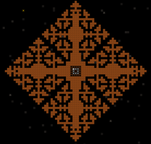
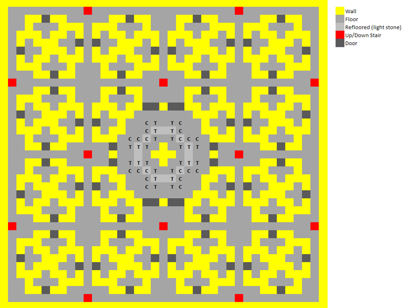
High density single floor housing
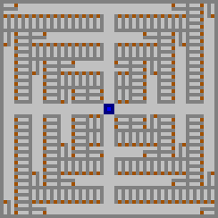
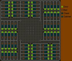
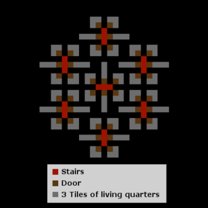
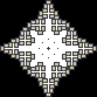
This fractal-inspired design combines space efficiency with wider access hallways to alleviate traffic jams. Stairs are placed in the middle, and the design can expand indefinitely. To decrease the size, remove the outermost perimeter hallway, and all connected bedrooms. To increase the size, use the picture as a guide and follow the same radial pattern.
| Size | Capacity | Max walk distance from center |
|---|---|---|
| 29x29 tiles | 48 dwarves | 23 steps |
| 45x45 tiles | 120 dwarves | 39 steps |
| 61x61 tiles | 224 dwarves | 55 steps |
| 77x77 tiles | 360 dwarves | 71 steps |
The multiply-overlapping single bedroom
A variation on the dormitory can produce large numbers of cheap, high quality bedrooms, very easily. Start with a large room, perhaps 20 x 20 tiles, and put many beds in it. From each of those beds, create a bedroom that covers the entire room. Each of the rooms overlaps the other rooms, and therefore suffers a quality modifier, but the room is large enough that its size can dominate the quality calculation. The quality hit for overlapping rooms is only applied once; your room either overlaps or it does not. With any reasonable amount of beds, it is easier and cheaper to furnish the one room with high quality items (at a penalty) than it is to carve out and furnish dozens of rooms separately. In addition, side by side beds in an open room is by far the most efficient use of space and walking distance. A room this size with a couple hundred beds in it, and some combination of smoothing, engraving, or multiple pieces of cheap furniture, can be of any quality level up to decent.
Staggered Doorless Rooms
Dwarves suffer no penalties for having other Dwarves travel through their bedrooms even when they are sleeping. They also don't require doors. Therefore, you can take advantage of diagonal pathing in room design for high-density, non-overlapping, multi-tile rooms.
The following diagram shows a 3x1 layout surrounding a 3x3 stairwell. The design can be repeated outwards as far as necessary.
---.B.---.B.---
.B.---.B.---.B.
---.B.---.B.---
.B.---XXX---.B.
---.B.XXX.B.---
.B.---XXX---.B.
---.B.---.B.---
.B.---.B.---.B.
---.B.---.B.---
Dwarves will navigate from the stairwell diagonally through rooms, while bedroom sizes can be applied at 3x3 (without the area leaking to adjoining rooms) allowing for some level of furnishing.
High density, single floor, quick housing
This design is nice in that it is very quick to lay since using shift to move the cursor moves in steps of 11 tiles. It is also very easy to increase or decrease their value by adding or removing furniture. Each 1-tile wide walkway is shared by 10 dwarves reducing congestion and each room can fit a bed, a chest and a cabinet leaving 1 free space for any miscellaneous items such as a statue for legendary dwarves, the free space is in the back of the room for the reason that it allows you to place blocking items that cannot be moved over there without sealing your dwarves in/out.
High density, multi-level
Optimizing space, minimizing walking distance, these are good things... for some...
Magical Multi-way Doors
The main point of this design is that it squeezes six bedrooms in a space of 9x8 squares (including walls) by using two-way doors. It's meant to be built across several Z-levels, making it take up a minimal amount of practical space. It can be easily mirrored, although that requires a wider corridor (or the use of four bedrooms instead of six on the other side).
| L | e | v | e | l | - | 1 | ¦ | L | e | v | e | l | 0 | ¦ | L | e | v | e | l | 1 | ||||||||||||||||
| + | - | - | - | - | - | + | ¦ | + | - | - | - | - | - | + | ¦ | + | - | - | - | - | - | + | ||||||||||||||
| ¦ | . | . | ¦ | . | . | ¦ | ¦ | ¦ | . | . | ¦ | . | . | ¦ | ¦ | ¦ | . | . | ¦ | . | . | ¦ | ||||||||||||||
| + | - | + | . | ¦ | . | + | - | + | ¦ | + | - | + | . | ¦ | . | + | - | + | ¦ | + | - | + | . | ¦ | . | + | - | + | ||||||||
| ¦ | . | + | D | - | D | + | . | ¦ | ¦ | ¦ | . | + | D | - | D | + | . | ¦ | ¦ | ¦ | . | + | D | - | D | + | . | ¦ | ||||||||
| ¦ | . | . | ¦ | X | ¦ | . | . | ¦ | ¦ | ¦ | . | . | ¦ | X | ¦ | . | . | ¦ | ¦ | ¦ | . | . | ¦ | X | ¦ | . | . | ¦ | ||||||||
| ¦ | - | - | - | D | - | - | - | ¦ | ¦ | - | - | - | + | . | + | - | - | - | ¦ | ¦ | - | - | - | D | - | - | - | ¦ | ||||||||
| ¦ | . | . | . | ¦ | . | . | . | ¦ | ¦ | . | . | . | . | . | . | . | . | . | ¦ | ¦ | . | . | . | ¦ | . | . | . | ¦ | ||||||||
| + | - | - | - | - | - | - | - | + | ¦ | ¦ | + | - | - | - | - | - | - | - | + |
Alternate layout:
This is a simpler (though slightly less compact) design using three-way doors.
| + | - | - | - | + | - | - | - | + | ||||
| ¦ | . | . | . | ¦ | . | . | . | ¦ | ||||
| + | - | - | - | + | - | - | - | D | - | - | - | + |
| ¦ | . | . | . | ¦ | X | X | X | ¦ | . | . | . | ¦ |
| + | - | - | - | D | - | - | - | + | - | - | - | + |
| ¦ | . | . | . | ¦ | . | . | . | ¦ | ||||
| + | - | - | - | + | - | - | - | + |
One apartment "unit" gives you 6 rooms using only 2 doors and it fits within a 13x7 space (including walls). Access to the apartments in the unit is through the 1-3 up/down stairwells in the center. This design can be expanded by repeating the same pattern one level down and/or by tiling together multiple units together on the same level.
Both designs mean that you have to build less doors per bedroom, which helps save time and materials.
Sandwich
A design to move bedrooms vertically spread across many unused Z levels easily. The rooms can be preferentially scaled up or down depending on needs. If space is reserved serves well for expansion of each bedroom as suitable.
The sandwich basically consists of a three tile wide hallway or wider. Up/Down Stairways are evenly distributed in increments which lead to one or more bedrooms as needed. Floor hatches can be used between the individual bedrooms like vertical doors, but, unlike doors, owned floor hatches can generate happy thoughts.
Recent science has established that having any "holes" in a room's walls reduces the apparent room value; this design is therefore particularly well-suited to producing high-value rooms.
| L | e | v | e | l | - | 1 | ¦ | L | e | v | e | l | 0 | ¦ | L | e | v | e | l | 1 | ||||||||||||||||||||||||||||
| + | - | - | - | - | - | - | - | - | - | - | - | + | ¦ | ¦ | + | - | - | - | - | - | - | - | - | - | - | - | + | |||||||||||||||||||||
| ¦ | B | . | ¦ | B | . | ¦ | B | . | ¦ | B | . | ¦ | ¦ | ¦ | ¦ | B | . | ¦ | B | . | ¦ | B | . | ¦ | B | . | ¦ | |||||||||||||||||||||
| ¦ | . | . | ¦ | . | . | ¦ | . | . | ¦ | . | . | ¦ | ¦ | - | - | - | - | - | - | - | - | - | - | - | - | - | ¦ | ¦ | . | . | ¦ | . | . | ¦ | . | . | ¦ | . | . | ¦ | ||||||||
| ¦ | X | . | ¦ | X | . | ¦ | X | . | ¦ | X | . | ¦ | ¦ | . | X | . | . | X | . | . | X | . | . | X | . | . | ¦ | ¦ | X | . | ¦ | X | . | ¦ | X | . | ¦ | X | . | ¦ | ||||||||
| ¦ | - | - | + | - | - | + | - | - | + | - | - | ¦ | ¦ | . | . | . | . | . | . | . | . | . | . | . | . | . | ¦ | ¦ | - | - | + | - | - | + | - | - | + | - | - | ¦ | ||||||||
| ¦ | X | . | ¦ | X | . | ¦ | X | . | ¦ | X | . | ¦ | ¦ | . | X | . | . | X | . | . | X | . | . | X | . | . | ¦ | ¦ | X | . | ¦ | X | . | ¦ | X | . | ¦ | X | . | ¦ | ||||||||
| ¦ | . | . | ¦ | . | . | ¦ | . | . | ¦ | . | . | ¦ | ¦ | - | - | - | - | - | - | - | - | - | - | - | - | - | ¦ | ¦ | . | . | ¦ | . | . | ¦ | . | . | ¦ | . | . | ¦ | ||||||||
| ¦ | B | . | ¦ | B | . | ¦ | B | . | ¦ | B | . | ¦ | ¦ | ¦ | ¦ | B | . | ¦ | B | . | ¦ | B | . | ¦ | B | . | ¦ | |||||||||||||||||||||
| + | - | - | - | - | - | - | - | - | - | - | - | + | ¦ | ¦ | + | - | - | - | - | - | - | - | - | - | - | - | + |
The bedroom design can be copied several times further up and down starting from Level 1 or -1 to exploit available space in neighbouring Z levels. The design is excellent as the space surrounding the hallway can be used for directly tying to the dining/meeting hall.
6-room clusters
This one is quite dense. There are six bedroom clusters. They can be built close to each other.
There are 7 6-room clusters here. If 5 Z-Levels of this are built, that's 5*7*6=210, which is plenty for most any fortress.
Living Pods (Residential Flats)
This design is compact and allows for a large number of rooms. Each room has 3 tiles plus a door. To add to the complex build an apartment level one level above or below the lobby - the stairs allow direct access. The design can be stretched to make the rooms 3x2 or 3x3, or to allow more rooms per floor, depending on your preference. Though not as visually impressive as the fractal patterns it is very efficient in that it can allow for large numbers of dwarves to easily access the main hallway. The pods are very quick to deploy as the interior (mined out) width of the pods exactly equals one Shift+move of the cursor. Highlight a full square with a horizontal shift+move then a vertical. Then unmark the 3 internal walls in both horizontal and vertical directions (each also 1 shift+move distance long), and finally mark in the four staircases. Sixteen bedrooms with extremely efficient pathing laid out in as many seconds.
| U | p | p | e | r | / | l | o | w | e | r | |||||||||||||||||||||||||||
| A | p | a | r | t | m | e | n | t | L | e | v | e | l | : | L | o | b | b | y | L | e | v | e | l | : | ||||||||||||
| + | - | - | - | - | - | - | - | - | - | - | - | + | + | - | - | - | - | - | - | - | - | - | - | - | + | . | . | ||||||||||
| ¦ | . | . | ¦ | . | . | ¦ | . | . | ¦ | . | . | ¦ | ¦ | . | . | ¦ | . | . | ¦ | . | . | ¦ | . | . | ¦ | . | . | O | |||||||||
| ¦ | . | + | - | + | . | ¦ | . | + | - | + | . | ¦ | ¦ | . | + | - | + | . | ¦ | . | + | - | + | . | ¦ | . | . | u | |||||||||
| ¦ | - | ¦ | X | ¦ | - | + | - | ¦ | X | ¦ | - | ¦ | ¦ | - | ¦ | X | + | - | - | - | + | X | + | - | + | . | . | t | |||||||||
| ¦ | . | + | - | + | . | ¦ | . | + | - | + | . | ¦ | ¦ | . | + | + | . | . | O | . | . | . | . | . | . | . | . | e | |||||||||
| ¦ | . | . | ¦ | . | . | ¦ | . | . | ¦ | . | . | ¦ | ¦ | . | . | ¦ | . | . | . | . | . | . | . | . | . | . | . | r | |||||||||
| ¦ | - | - | + | - | - | + | - | - | + | - | - | ¦ | ¦ | - | - | ¦ | O | . | . | . | O | + | - | - | + | . | . | ||||||||||
| ¦ | . | . | ¦ | . | . | ¦ | . | . | ¦ | . | . | ¦ | ¦ | . | . | ¦ | . | . | . | . | . | ¦ | . | . | ¦ | . | . | H | |||||||||
| ¦ | . | + | - | + | . | ¦ | . | + | - | + | . | ¦ | ¦ | . | + | + | . | . | O | . | . | + | + | . | ¦ | . | . | a | |||||||||
| ¦ | - | ¦ | X | ¦ | - | + | - | ¦ | X | ¦ | - | ¦ | ¦ | - | ¦ | X | + | - | - | - | + | X | ¦ | - | ¦ | . | . | l | |||||||||
| ¦ | . | + | - | + | . | ¦ | . | + | - | + | . | ¦ | ¦ | . | + | - | + | . | ¦ | . | + | - | + | . | ¦ | . | . | l | |||||||||
| ¦ | . | . | ¦ | . | . | ¦ | . | . | ¦ | . | . | ¦ | ¦ | . | . | ¦ | . | . | ¦ | . | . | ¦ | . | . | ¦ | . | . | ||||||||||
| + | - | - | - | - | - | - | - | - | - | - | - | + | + | - | - | - | - | - | - | - | - | - | - | - | + | . | . |
Pod variant
This is an example of varying the above to suit personal taste. Three significant changes have been made:
- 1) 2 pairs of vertical access stairs feed upward, instead of one horizontal hallway.
- 2) The entire design has been expanded (to 15x15, vs 13x13 above), but rooms have not been expanded to fill all available space - not yet. That will be done if/as need arises, and many of the 3-tile rooms can become 5- or 7-tile1, or two joined together to become 12-tile suites2.
- 3) Allow for a central waterfall with drain system*.
Upper Apartment         Lobby         Lower Apartment
   Level(s*):           Level:           Level(s*):
+-----+ +-----+    +-----+ +-----+    +-----+ +-----+
¦..¦..¦ ¦..¦..¦    ¦..¦..¦ ¦..¦..¦    ¦..¦..¦ ¦..¦..¦
¦.+-+.¦ ¦.+-+.¦    ¦.+-+.¦ ¦.+-+.¦    ¦.+-+.¦ ¦.+-+.¦
¦-¦X¦-¦ ¦-¦X¦-¦    ¦-¦X¦-----¦X¦-¦    ¦-¦X¦-----¦X¦-¦
¦.+¦+.¦ ¦.+-+.¦    ¦.+¦+.OOO.+-+.¦    ¦.+¦+..¦..+-+.¦
¦..¦..¦ ¦..¦..¦    ¦..¦.......¦..¦    ¦..¦.+---+.¦..¦
+--+-------+--+    +--¦..###..¦--+    +--¦.¦~~~¦.¦--+
   ¦XX#~#XX¦          ¦<<#~#<<¦          ¦-¦~¦~¦-¦
+--+-------+--+    +--¦..###..¦--+    +--¦.¦~~~¦.¦--+
¦..¦..¦ ¦..¦..¦    ¦..¦.......¦..¦    ¦..¦.+---+.¦..¦
¦.+-+.¦ ¦.+-+.¦    ¦.+-+.OOO.+-+.¦    ¦.+-+..¦..+-+.¦
¦-¦X¦-¦ ¦-¦X¦-¦    ¦-¦X¦-----¦X¦-¦    ¦-¦X¦-----¦X¦-¦
¦.+-+.¦ ¦.+-+.¦    ¦.+-+.¦ ¦.+-+.¦    ¦.+-+.¦ ¦.+-+.¦
¦..¦..¦ ¦..¦..¦    ¦..¦..¦ ¦..¦..¦    ¦..¦..¦ ¦..¦..¦
+-----+ +-----+    +-----+ +-----+    +-----+ +-----+}}
Legend:
  X = up/down stair
  < = up stair
  ~ = flowing water, in waterfall and drain
  # = [[grate]] or floor [[bars]] over drain
  ¦ = solid block at base of waterfall
  O = [[statue]]s (though a [[zoo]] or booze stockpiles could work as well)
Notes:
- 1) There is a central, vertical line of unused tiles, allowing adjacent rooms to be expanded to 5 tiles large.
- 2) Expanding out one more tile beyond the outer boundaries can create size 5-11 rooms, or size 19 if two are connected.
- 3) A size 15 room is ample for any noble, with the possible exception of a king/queen.
- * The floor plan for the waterfall/drain system may vary from floor to floor, and by personal taste. Eventually it can be routed off and out one side, and the full interior area of all levels below that reserved for apartments.
(Note - It's easy to flood an area with a waterfall such as this - be sure you are familiar with the technique before risking an entire dormitory (or the lower parts, at least) on it.)
Greek Cross design
Minimizing walking distances requires good use of vertical space. This plan is simple, scalable, and only takes up a few floors - 6 if you have 32 per floor, 4 if you have 48. The maximum walking distance should be less than 20 (walking up/down stairs counts as one distance.).
A Quickfort blueprint for the 32 tile Greek Cross design is available here
Shaft design
The Shaft design allows various options for entry direction and central "shaft" use. The central shaft may be altered to create dining rooms and offices for minor nobles, "deluxe" bedrooms, hospital beds, or simply more bedrooms. The design can easily accommodate several different room sizes while maintaining efficiency. However, the design utilizes Z-levels for efficiency, and you must build several levels of Shaft designs to accommodate a fully grown fortress.
The Shaft design can fit 20 2x2 rooms, or 30 1x1 rooms.
Tileable shaft design
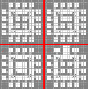
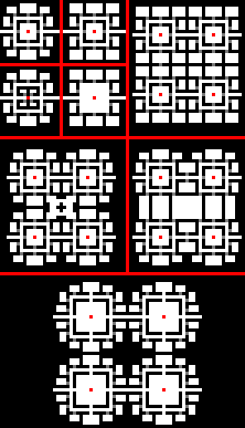
The tileable shaft design is a further expansion of the general shaft design above, coming in somewhere between the simple geometric designs and the vastly more complex fractal designs. These are designs that can be symmetrically tiled, that means concatenated in all six directions and are thus suited both for manual design as well as macro-automation. They allow the user to extend the same pattern over very large areas and to easily extend the available space per room up to a given size by tearing down just a few walls. Additionally, they can be suited for bedrooms as well as work and storage.
The downsides are that they're not especially optimized for walking distance or large hallways, and the necessity of the main access shaft on the z-level (stairs) having to be in the central-most tile (marked red in the examples) to allow z-level stacking.
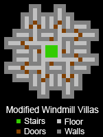
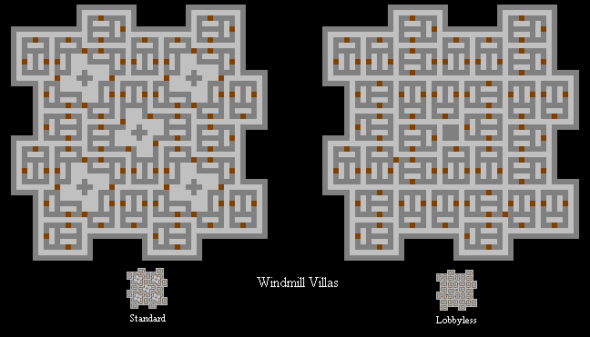
Modified Windmill Villas
This is the most efficient method I have seen, and it keeps the central staircase as well.
(Calculations use 8 levels)
- Dwarfs per level = 28
- Levels needed for 200 = 7.1
- Max distance (including Z) = 15
- Average distance = 10.2
- Average distance per level = 5.4
Squarified Tri-way Doors
Four "tri-way doors" patterns adjacent to each other, squarified with 4 normal rooms and 2 noble rooms.
This results in 30 bedrooms in a 21x15 rectangular space (counting all walls, including external ones). Can be repeated multiple z-levels, accessed from a lobby hallway.
| + | - | - | - | - | - | - | - | + | - | - | - | + | - | - | - | + | - | - | - | + |
| ¦ | . | . | . | . | . | D | X | ¦ | . | . | . | ¦ | . | . | . | ¦ | . | . | . | ¦ |
| + | - | - | - | + | - | - | - | + | - | - | - | D | - | + | - | + | - | + | D | ¦ |
| ¦ | . | . | . | ¦ | . | . | . | ¦ | . | . | . | ¦ | X | ¦ | . | . | . | ¦ | X | ¦ |
| + | - | - | - | D | - | + | - | + | - | + | - | + | - | D | - | - | - | + | D | ¦ |
| ¦ | . | . | . | ¦ | X | ¦ | . | . | . | ¦ | . | . | . | ¦ | . | . | . | ¦ | . | ¦ |
| + | - | + | - | + | - | D | - | - | - | + | - | - | - | + | - | - | - | + | . | ¦ |
| ¦ | . | ¦ | . | . | . | ¦ | . | . | . | ¦ | . | . | . | ¦ | . | . | . | ¦ | . | ¦ |
| ¦ | . | + | - | - | - | + | - | - | - | + | - | - | - | D | - | + | - | + | - | + |
| ¦ | . | ¦ | . | . | . | ¦ | . | . | . | ¦ | . | . | . | ¦ | X | ¦ | . | . | . | ¦ |
| ¦ | D | + | - | - | - | D | - | + | - | + | - | + | - | + | - | D | - | - | - | + |
| ¦ | X | ¦ | . | . | . | ¦ | X | ¦ | . | . | . | ¦ | . | . | . | ¦ | . | . | . | ¦ |
| ¦ | D | + | - | + | - | + | - | D | - | - | - | + | - | - | - | + | - | - | - | + |
| ¦ | . | . | . | ¦ | . | . | . | ¦ | . | . | . | ¦ | X | D | . | . | . | . | . | ¦ |
| + | - | - | - | + | - | - | - | + | - | - | - | + | - | - | - | - | - | - | - | + |
Large Squarified Tri-way Doors
By playing with the basic building block of the above design, and a 25x25 space, you can get this elegant square and symmetrical design:
| ╔ | ═ | ╦ | ═ | ╦ | ═ | ═ | ═ | ╦ | ═ | ╦ | ═ | ╦ | ═ | ╦ | ═ | ╦ | ═ | ═ | ═ | ╦ | ═ | ╦ | ═ | ╗ |
| ║ | + | X | + | ║ | ║ | ║ | ║ | ║ | + | X | + | ║ | ||||||||||||
| ║ | ╠ | ═ | ╬ | ═ | ╦ | ═ | ╣ | ║ | ║ | ║ | ╠ | ═ | ╦ | ═ | ╬ | ═ | ╣ | ║ | ||||||
| ║ | ║ | ║ | ║ | ║ | ║ | ║ | ║ | ║ | ║ | ║ | ║ | ║ | ||||||||||||
| ╠ | ═ | ╣ | ║ | ║ | ╠ | ═ | + | ═ | ╬ | ═ | + | ═ | ╣ | ║ | ║ | ╠ | ═ | ╣ | ||||||
| ║ | ║ | ║ | ║ | ║ | X | ║ | ║ | ║ | X | ║ | ║ | ║ | ║ | ║ | ||||||||||
| ║ | ╠ | ═ | + | ═ | ╬ | ═ | + | ═ | ╣ | ║ | ╠ | ═ | + | ═ | ╬ | ═ | + | ═ | ╣ | ║ | ||||
| ║ | ║ | X | ║ | ║ | ║ | ║ | ║ | ║ | ║ | ║ | ║ | X | ║ | ║ | ||||||||||
| ╠ | ═ | + | ═ | ╣ | ║ | ║ | ╠ | ═ | ╩ | ═ | ╣ | ║ | ║ | ╠ | ═ | + | ═ | ╣ | ||||||
| ║ | ║ | ║ | ║ | ║ | ║ | ║ | ║ | ║ | ║ | ║ | ║ | |||||||||||||
| ║ | ║ | ╠ | ═ | ╩ | ═ | ╬ | ═ | ╣ | ╔ | ═ | ╩ | ═ | ╬ | ═ | ╩ | ═ | ╣ | ║ | ║ | |||||
| ║ | ║ | ║ | ║ | X | + | ║ | ║ | ║ | ║ | ║ | ||||||||||||||
| ╠ | ═ | ╬ | ═ | ╬ | ═ | ═ | ═ | + | ═ | ╩ | ═ | ╬ | ═ | ╦ | ═ | + | ═ | ═ | ═ | ╬ | ═ | ╬ | ═ | ╣ |
| ║ | ║ | ║ | ║ | ║ | + | X | ║ | ║ | ║ | ║ | ||||||||||||||
| ║ | ║ | ╠ | ═ | ╦ | ═ | ╬ | ═ | ╦ | ═ | ╝ | ╠ | ═ | ╬ | ═ | ╦ | ═ | ╣ | ║ | ║ | |||||
| ║ | ║ | ║ | ║ | ║ | ║ | ║ | ║ | ║ | ║ | ║ | ║ | |||||||||||||
| ╠ | ═ | + | ═ | ╣ | ║ | ║ | ╠ | ═ | ╦ | ═ | ╣ | ║ | ║ | ╠ | ═ | + | ═ | ╣ | ||||||
| ║ | ║ | X | ║ | ║ | ║ | ║ | ║ | ║ | ║ | ║ | ║ | X | ║ | ║ | ||||||||||
| ║ | ╠ | ═ | + | ═ | ╬ | ═ | + | ═ | ╣ | ║ | ╠ | ═ | + | ═ | ╬ | ═ | + | ═ | ╣ | ║ | ||||
| ║ | ║ | ║ | ║ | ║ | X | ║ | ║ | ║ | X | ║ | ║ | ║ | ║ | ║ | ||||||||||
| ╠ | ═ | ╣ | ║ | ║ | ╠ | ═ | + | ═ | ╬ | ═ | + | ═ | ╣ | ║ | ║ | ╠ | ═ | ╣ | ||||||
| ║ | ║ | ║ | ║ | ║ | ║ | ║ | ║ | ║ | ║ | ║ | ║ | ║ | ||||||||||||
| ║ | ╠ | ═ | ╬ | ═ | ╩ | ═ | ╣ | ║ | ║ | ║ | ╠ | ═ | ╩ | ═ | ╬ | ═ | ╣ | ║ | ||||||
| ║ | + | X | + | ║ | ║ | ║ | ║ | ║ | + | X | + | ║ | ||||||||||||
| ╚ | ═ | ╩ | ═ | ╩ | ═ | ═ | ═ | ╩ | ═ | ╩ | ═ | ╩ | ═ | ╩ | ═ | ╩ | ═ | ═ | ═ | ╩ | ═ | ╩ | ═ | ╝ |
This is the most space-efficient design when aiming for bedrooms with exactly three tiles of space which are accessible without crossing another bedroom. It uses only 9 tiles per bedroom overall, an amazing feat, since the mathematical minimum for the problem given is 8 tiles per bedroom! Such bedroom allocations are not in any way required, however: normal citizens are perfectly happy with an overlapping bedroom in a large hall packed to capacity with beds.
Repeating patterns & fractals
Art for art's sake... and if it's functional, so much the better...
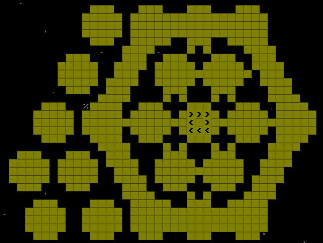
Blossom
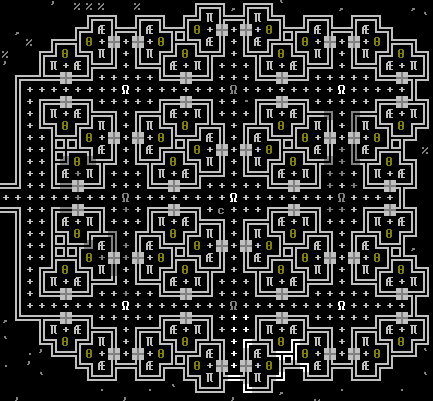
Not truly fractal, but inspired by other fractals with a more aesthetic appeal. A slightly stripped down quickfort version of this is available here.
Tessellated Apartments
Access can be from above and/or below by the stairs, or a hallway can be run into the dining room level by removing the bedroom at one of the cardinal points. This design can be repeated as far as desired in the X, Y, and Z directions.
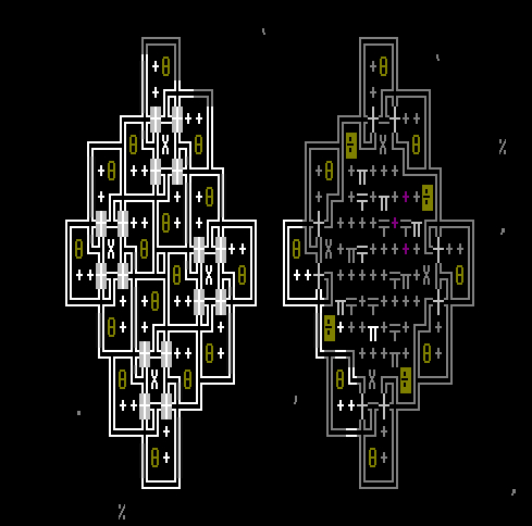
Noble Hive Pods
A geometric pattern for Noble housing trying for interesting aesthetics and high mobility. The basic tiling pattern is shown on the left; one possible way to join them, involving surrounding corridors and a central staircase and a jillion doors, on the right.
Fractal designs
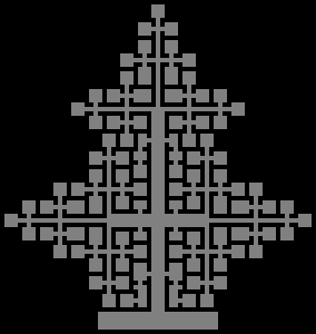
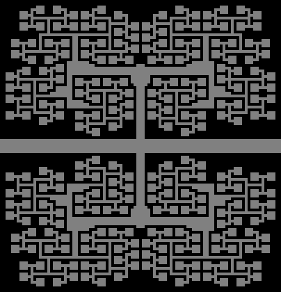
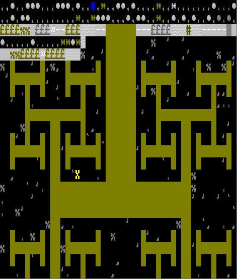
Betting on design beauty and on geometrical symmetry first, fractal designs can also be, at the same time, very space and walk efficient. They however require a lot of time and space both to plan and execute and are most likely out of reach of all but the most serious players. On the other hand, most of the designs displayed below would be avoided by the most serious players, due to their lack of serious Z-level access and incongruity with almost any general access plan. Most players however agree that they are the most incredible of all the designs around, if not for the sheer challenge of successfully executing something as complex, as for the extra touch it gives to the fortress as a whole once it is done.
More fractal bedroom designs based upon the H-Tree (pictured above) can be found at this user page.
Fractal modified for 3d
This was created by palin88 from Bay12Games forum in order to make a three-dimensional version of Raynard's Fractal Design.
Hallway with office
+---------+╤¦ ¦b+---------+
¦B¦B¦B¦B¦B¦╥¦ ¦r¦B¦B¦B¦B¦B¦
¦k¦k¦k¦k¦k¦H¦ ¦H¦k¦k¦k¦k¦k¦
¦c¦c¦c¦c¦c¦     ¦c¦c¦c¦c¦c¦
¦D¦D¦D¦D¦D¦     ¦D¦D¦D¦D¦D¦
             X
¦D¦D¦D¦D¦D¦     ¦D¦D¦D¦D¦D¦
¦c¦c¦c¦c¦c¦     ¦c¦c¦c¦c¦c¦
¦k¦k¦k¦k¦k¦H¦ ¦H¦k¦k¦k¦k¦k¦
¦B¦B¦B¦B¦B¦╥¦ ¦╥¦B¦B¦B¦B¦B¦
+---------+╤¦ ¦╤+---------+
Legend:
B: Bed
D: Door
X: Staircase
╥: Chair
╤: Table
c: Chest or Bag
k: Cabinet
An interesting design made to consume less space but still look pretty. It can be repeated infinitely, or at least as far as your embark square goes. One may also decide to use the stairwells as noble offices or rooms, or put the staircase somewhere else and put a well where the staircase would be.
| Furniture |
Altar • Animal trap • Armor stand • Bed • Box • Bucket • Cabinet • Cage • Coffin • Display case • Pedestal • Restraint • Seat • Slab • Statue • Table • Weapon rack |
|---|---|
| Tools | |
| Access | |
| Constructions | |
| Machine and trap parts |
Axle • Gear assembly • Lever • Millstone • Pressure plate • Roller • Screw pump • Support • Trap • Water wheel • Windmill |
| Other buildings | |
| Related articles | |

